Fiore Traveling Store – Experience Design

As a continuation of Fiore, the luxury perfume store I designed, I expanded the brand out in both an app and a website to be used by the regular consumers and those who partake in the membership and exclusivity of the store. I also continued to push it into the omnichannel design of a traveling store since my first design had been so luxury and feeling heavy. I decided to continue it on and focus on adjusting that experience to a broader audience.
Mobile App
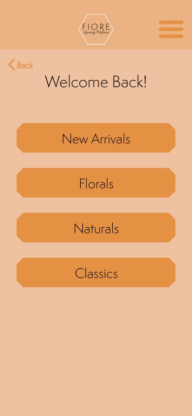
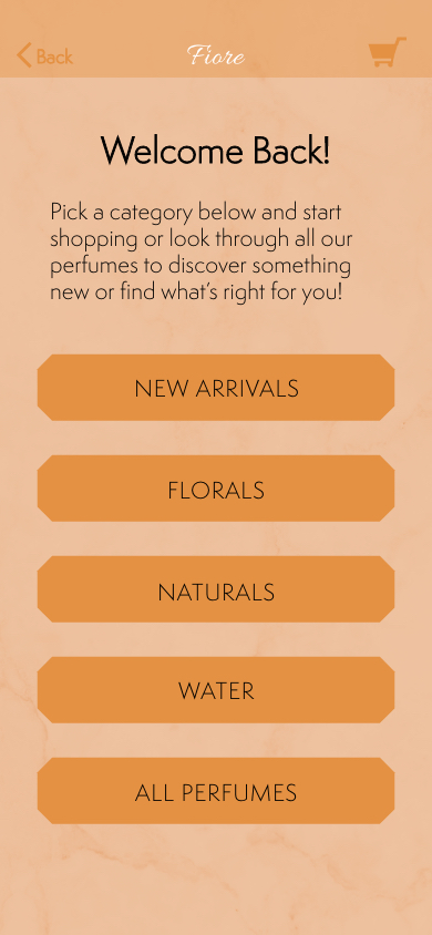
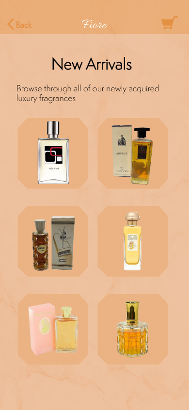
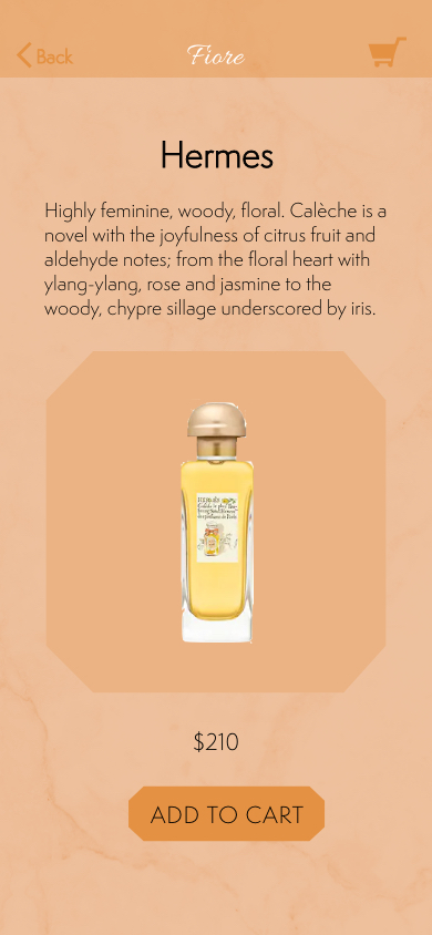
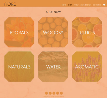
This app is meant to facilitate shopping from the store but also serve their members and continue their exclusive perfume offerings. The first track shown below is just the traditional experience of being able to browse and buy the perfumes of their choices. They can look through different types of perfumes and have access to the general catalog of the store.
The original design was lacking a cohesive, luxury feeling. The top nav started out too big and with unnecessary features and there was a big need for body copy to introduce the brand voice. There was a considerable amount of unresolved space that needed to be revisited.
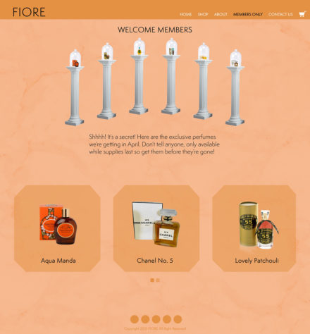
I added a texture to the background to make the open space feel more resolved. I also worked in some body copy that showed a much more welcoming feeling that greeted consumers to make them feel welcomed into the store. I also brought down the scale of some items and polished the typography. You can access the prototype here.
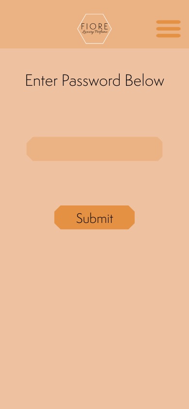
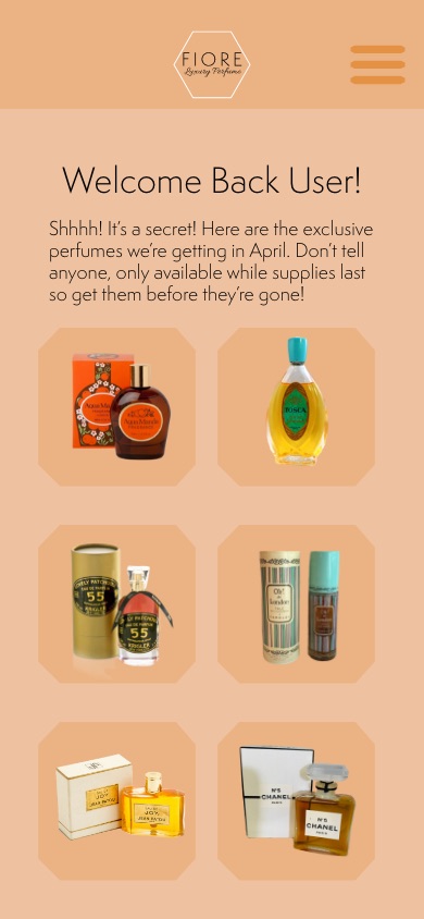
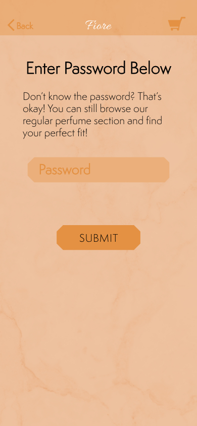
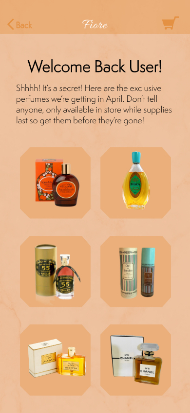
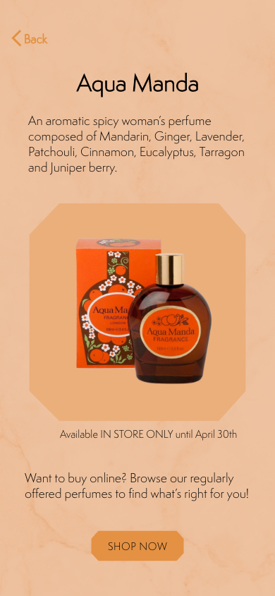
The other offering of the app is the ability for members to obtain a login and gain an exclusive look at the rare offerings of perfumes that rotate to the store. In order to keep the exclusivity of it, users aren’t able to buy these perfumes, they can only learn about them but must go buy them in store.
Website
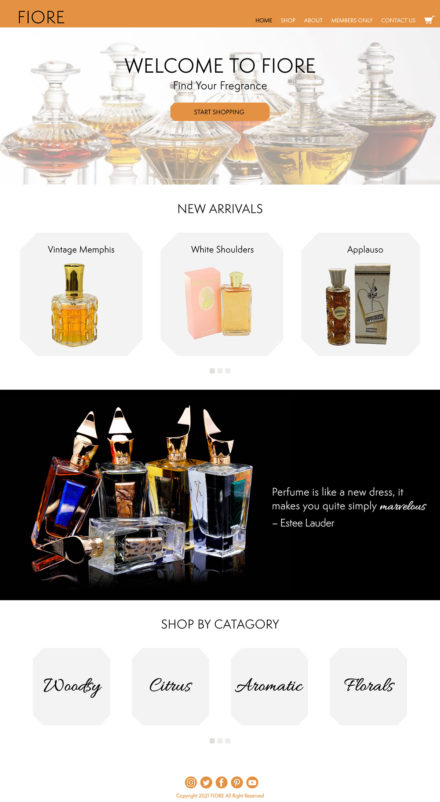
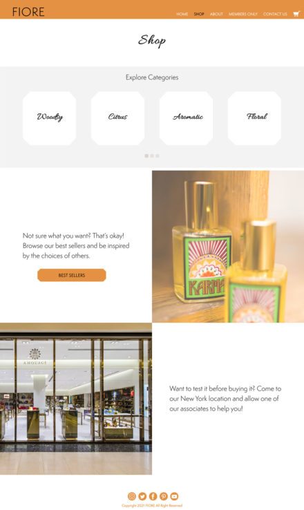
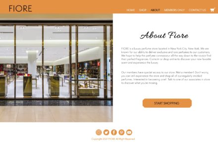
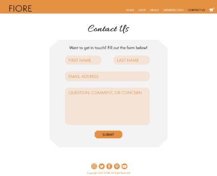
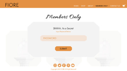
The website also serves the functions of the app, allowing for consumers to browse and buy perfumes and if they’re a member, get a sneak peek into the rare offerings coming into the store. The website also has the ability to contact the store which isn’t offered in the app.
Originally the website looked a lot more like the app with the inclusion of the orange background and keeping in the subtle texture but it didn’t feel quite as luxurious as was intended. There was also an issue with now images were being treated so I ended up changing it pretty greatly.
After working with this design for a while I decided to completely change it to allow for more open space and let all the elements breathe. The clean white also helped to push the lux feeling and make the site feel much less cramped and busy. You can access the prototype here.
Omnichannel Design
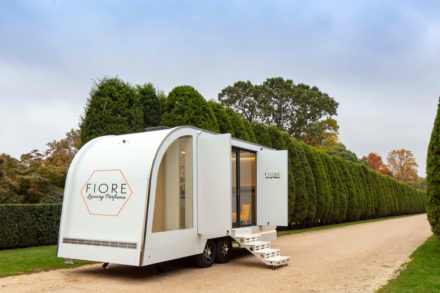
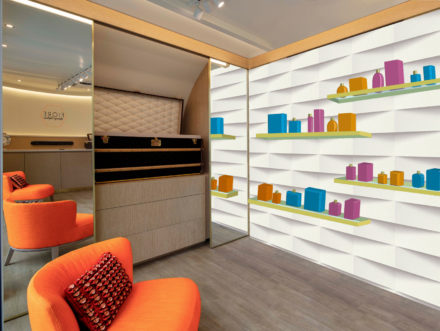
In order to expand the luxury store, I decided to change up its audience and accessibility. The original store only carries luxury brands and it is located in New York which keeps the audience relatively small. In order to further this brand I decided to still have them carry higher end perfumes but not to the same caliber as the store. Putting this store in a mobile capacity allows the Fiore experience to be brought to more people and for them to have business around the country. It also brings it to people with a more normal budget and approaches the buying power of the average consumer. The inside has the same feeling as the store, allowing the consumers to have that moment of luxury while shopping.
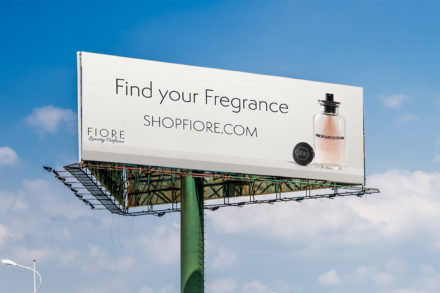
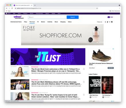
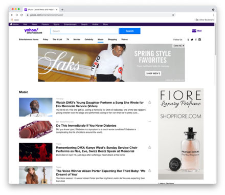
In order to promote the website I also created both physical and digital advertisements in different layouts for different types of ad spots.
