Experience Design: Guide to the Spirits San Juan

For my experience design project, I expounded on my people driven design project and created a mobile app, website, and an omnichannel design. To understand these designs, one much first understand the persona that I was designing for initially. The persona that I designed for in my people driven design project that later bled into this project was a 30 year old man from San Juan Puerto Rico in 1965 who was interested in cocktails, for the purpose of my assignment I named him Luis. I created a brand that reflects 1960 Mid Century Modern aesthetics with layered flat graphics, vibrant colors, and basic shapes. For the mobile app I really focused on the aspect of users being able to interact with and track which drinks that they had already experienced, in the website I focused on the usability of different features, and how it points users to interact with my designs, and lastly for the omnichannel I focused on elements that would pull users more deeply in to the Guide to the Spirits San Juan brand.
Mobile App
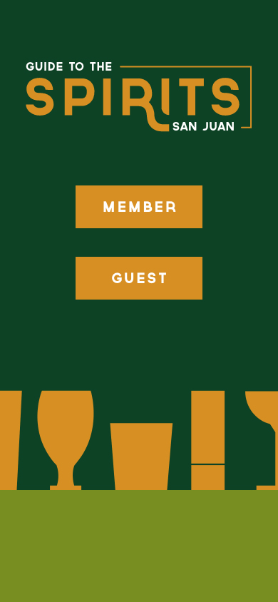
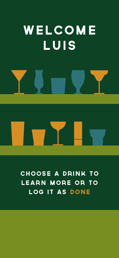
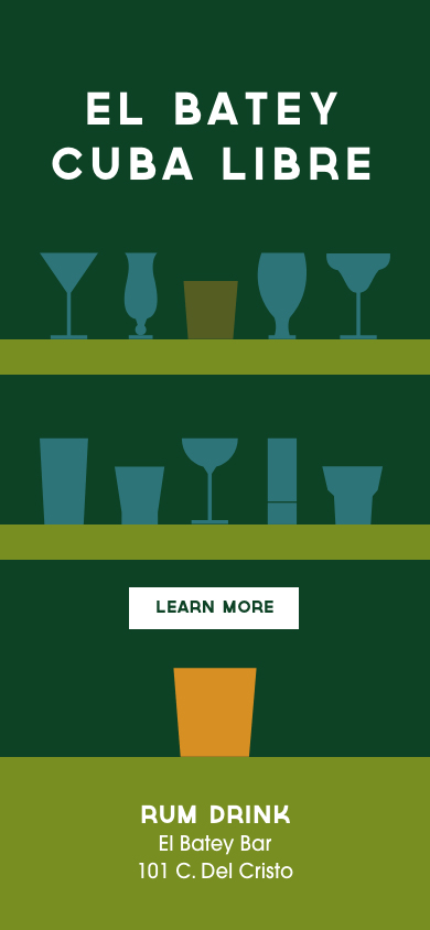
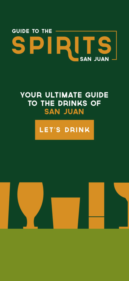
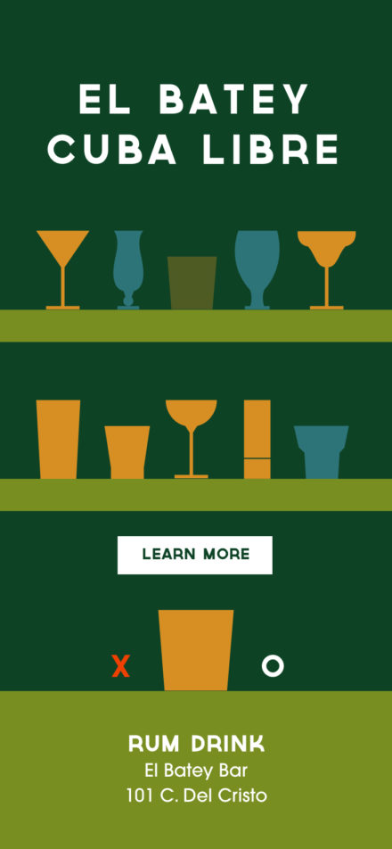
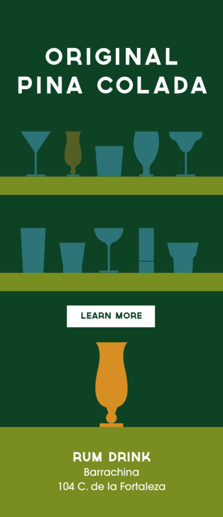
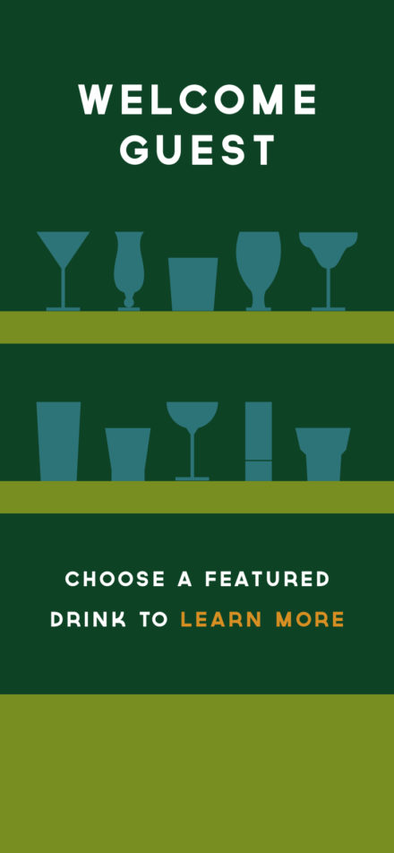
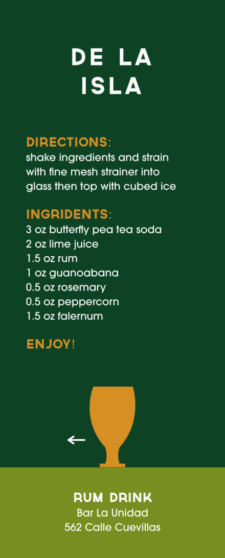
The app that I created for Guide to the Spirit San Juan is for both subscribers/members and non members alike. My goal in creating this app was to give Guide to the Sprits San Juan partakers the opportunity to track the drinks that they had already experienced, while also learning about the other drinks that they had not yet tried. For non members, I just wanted them to be able to have a reference point as to what the Guide to the Spirits was all about. I wanted this app to be interactive, and I really stuck with the brand of my original pieces that I created for the People Driven Design project. I used the different colors that were a part of my brand to reflect different things in order to add a layer of complexity to the design as well. You can view a working prototype with my link below.
https://xd.adobe.com/view/dd87670e-7d5b-4233-92dd-17faf57b5df8-88d4/
Website
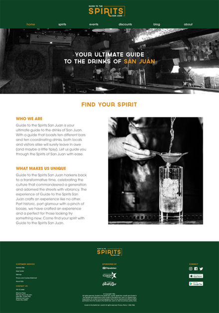
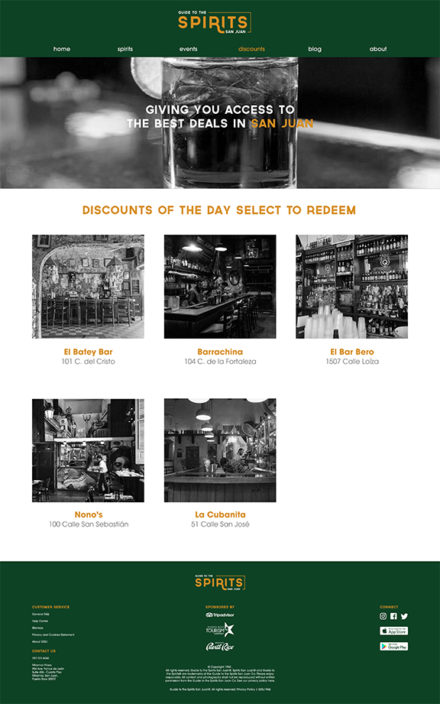
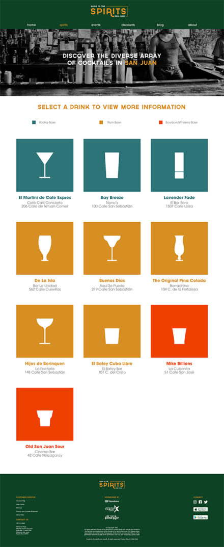
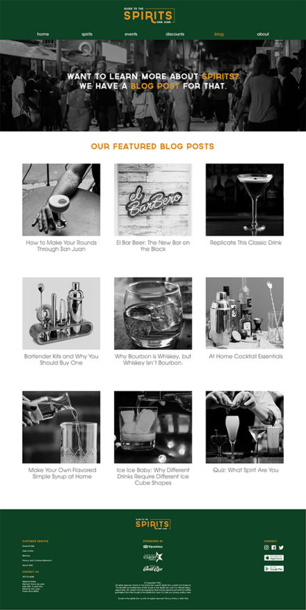
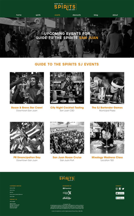
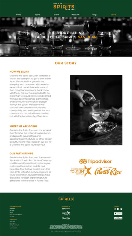
For the website, I decided to make 6 pages that coordinated with the 6 options on my navigation bar. The navigation bar options are; home, sprits, events, discounts, blog, and about. I utilized these to really get my user to interact with the content that Guide to the Spirits has to offer, and to encourage visitors to partake in the guide and or make their own cocktails at home. I have a grid that I stuck to throughout the design that really helped unify the design as a whole, and I used unifying elements such as color, typography size and style, and black and white imagery. I also decided that some of my content that was in my initial concepts was just too much, so I ended up making a hover state on a couple of the pages in order to declutter my design. You can view a working prototype of my website with the link below.
Omnichannel Design
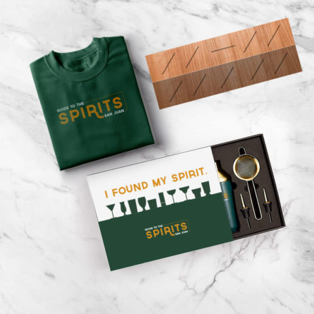
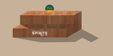
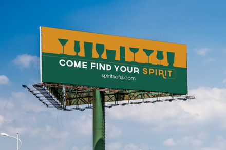
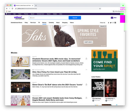
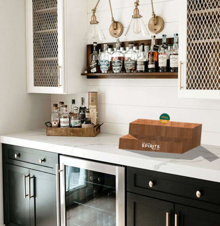
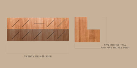
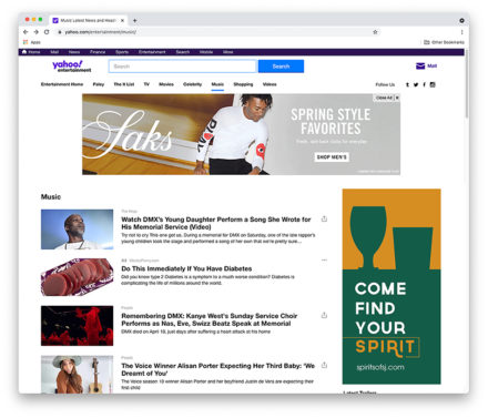
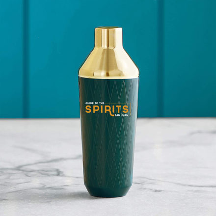
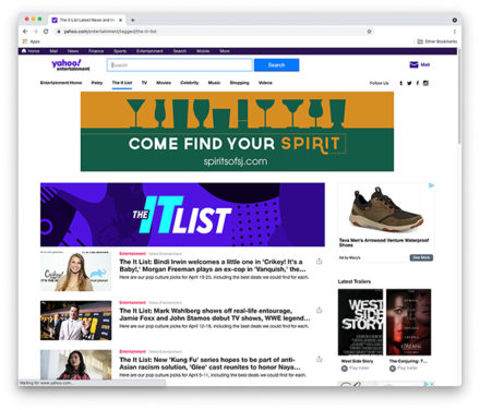
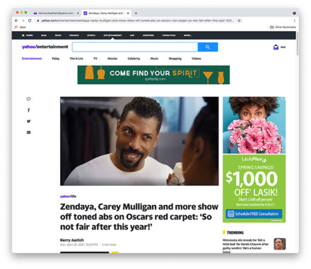
We were charge to expand this project into an omnicahnnel design (billboards, web ads, and an omnichannel of our choice) for our client. I had so much fun finding new ways to convey the brand of Guide to the spirits, and as you can see below I pulled elements from my original designs. I also expanded my omnichannel to include a couple of things, one being a Guide to the Spirits San Juan cocktail kit, another being a tee shirt, and the last being a display where guide partakers can display their favorite coasters that they collected at the Guide to the Spirits stops. I was inspired by the offerings of the bourbon trail when you complete your passport and receive a tee shirt, that is really the direction that I took with this. I wanted people to have a tangible and visible reminder of Guide to the Spirits, while also making something that they could even use as a decorative piece in their home. I chose wood, as to convey that this display is something to be placed out in the open and not hidden, so on something like a shelf, buffet, or bar would be ideal.
