Experience Design: Hats From Scratch
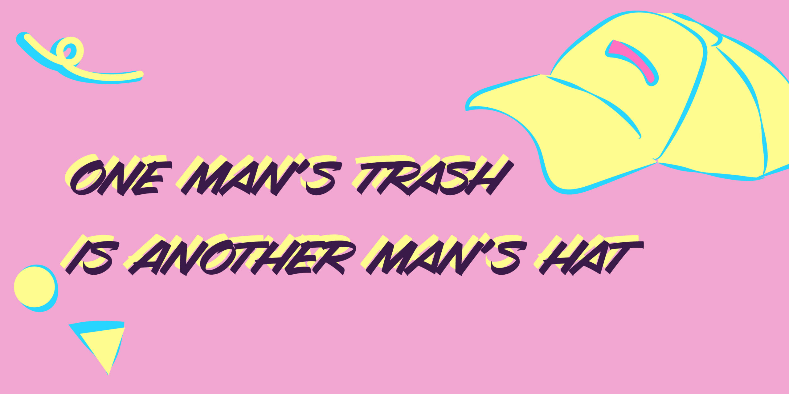
In a previous project, I created a kit that people could buy that would not only give them tutorials and tools to create hats, but also encourage them to use cheap materials. Inspired by early 90’s aesthetic and set up to be marketed towards a lower-income audience, Hats From Scratch’s branding was colorful and uplifting.
Moving onto this project, I was tasked with taking that product and the brand behind it and applying it to other realms of design, such as app design and advertisements.
Mobile App
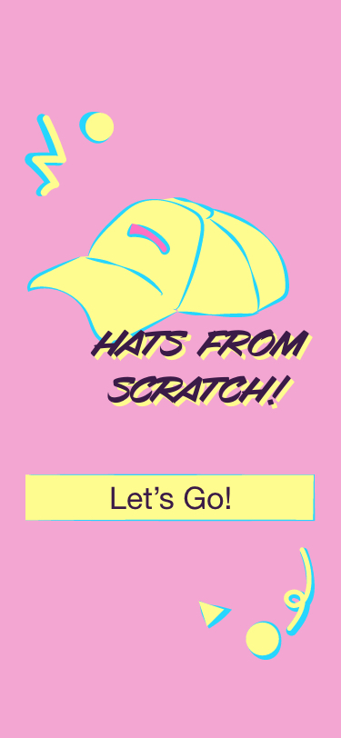
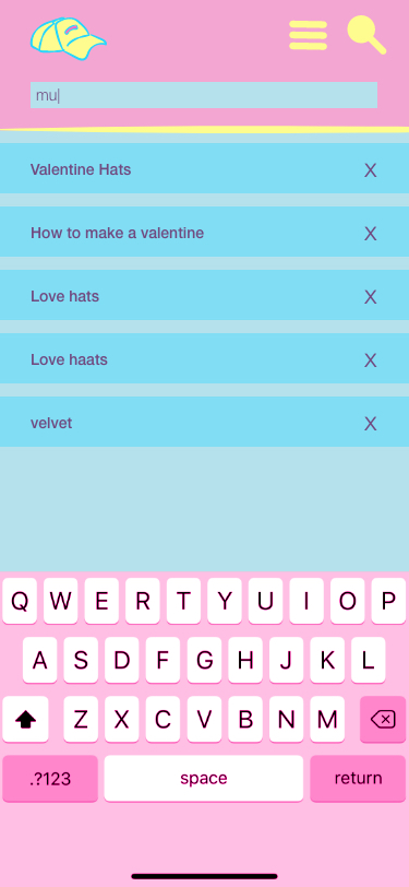
Our first step was creating a mobile app. Since the hat-making kit I had previously designed was made to stand alone, including tutorials and all, I decided that Hats From Scratch could benefit from having a platform where people would be able to interact and share their own tutorials/tips. In this way, the app would supplement the community and mentorships that the kit lacked.
You can click through the prototype here
Website
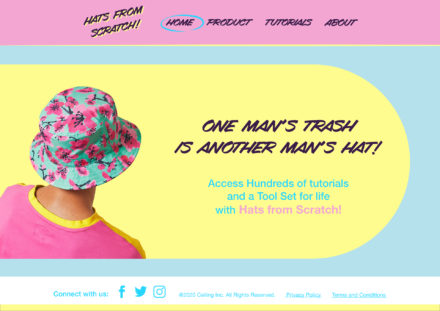
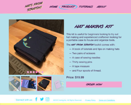
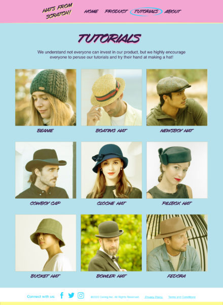
While we were working on polishing the app, we were tasked with creating a website that would further advertise our initial product. The hat-making kit on its own was a rather simple project and I felt that tying the app into the app felt wonky, so I wrote up a few pages for the kit and then added a page of tutorials. At the end of the day, I think Hats From Scratch as a company would rather put their tutorials out into the world and let those interested in more specifics/tips be the ones to buy the kit.
You can click through the prototype here.
Omnichannel Design
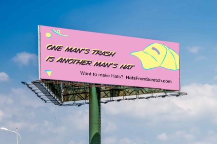
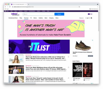
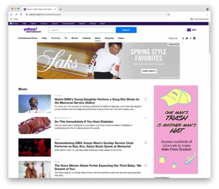
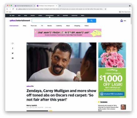
Our last task for this project was to create a billboard, some web ads, and an extra piece of collateral that would reach an audience that the previous work didn’t reach. For the billboard and ads, the hardest part was simplifying the brand down into an eye catching phrase, but once I figured out the phrasing it was easy to apply the various elements to the different dimensions.
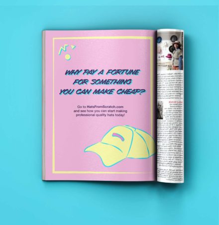
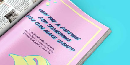
For the extra collateral, I decided to create a magazine ad; since all the previous ads and marketing had been digital (save for the billboard), I figured that a magazine ad would reach out to an older audience that had a greater attachment to physicality. While the ad still directs them to a website, the website is simple enough to navigate that I figured audiences that weren’t tech savvy would still find their way around.
