A few sentences that talk about your project. Share who it was for, what how you determined what they needed, and why you made what you did.
Process Work
This project began with the creation of a randomized persona to help us learn how to decipher what is important in design and how to have this information inform the rest of the design outcomes. My persona, who I named Beth, is a 30 year old single woman living in New York City in the 1960s. Given all of the information below with my persona, I then had to narrow focus and pull out the facets of her identity I would be designing for.
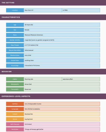
From there it was time to figure out what all six of these pieces of Beth had in common which led to me creating a connection map to further break them down. I quickly found quite a bit of overlap between her interest which is perfume and her large amounts of disposable income.
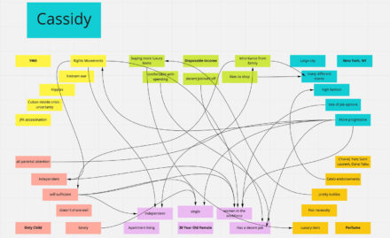
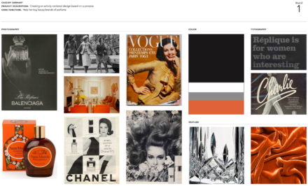
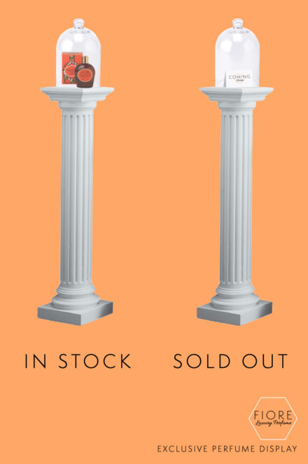
Because of this, the direction I chose to pursue was a luxury perfume store that would be in New York City. But this wouldn’t be a normal luxury perfume store, it also has a rare perfume section to help those passionate about it expand their collection. Knowing I wanted a feeling of exclusivity to be paired with the overall concept of the store, I got to work on nailing out how I would achieve that effect. I landed on creating a store which would display a few rare perfumes every month on a rotation and that once they were gone, they would be sold out and not come back to the store so if someone wanted to collect these perfumes, they have to come in for each new release in order to obtain it. I also in these beginning stages worked on the style and feeling I wanted the brand and the store to embody.
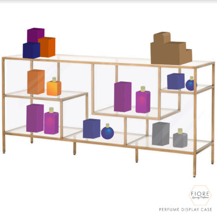
Upon receiving feedback from my peers wondering what the store would do after these rare items were sold, I revisited the concept of my store, adding in a normal shopping section for luxury perfumes that would be the regular focus so that only members or people in the know would understand what the displays in the back of the store would be for. With a better understanding of what my store needed to accomplish and a more solidified styleboard, I went to work mocking up the different displays and figuring what the layout of the store would be.
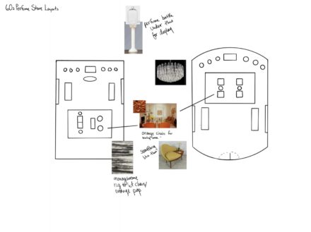
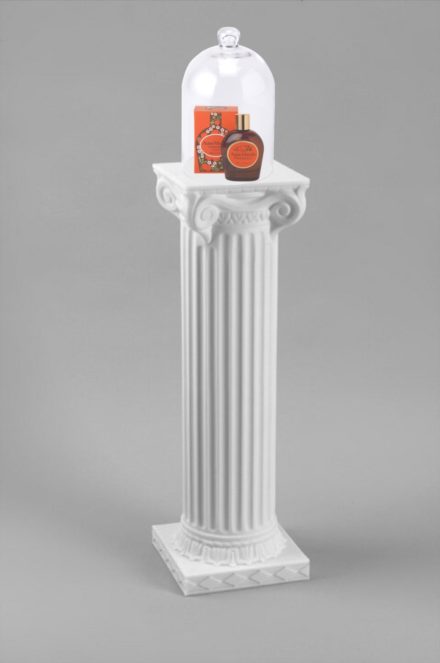
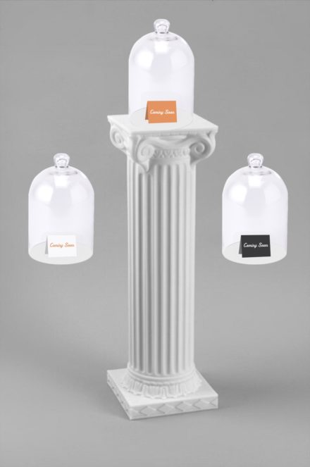
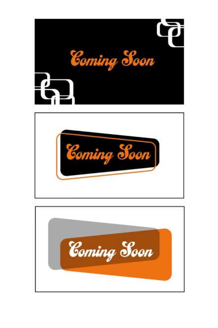
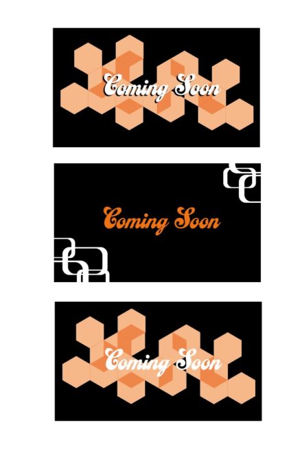
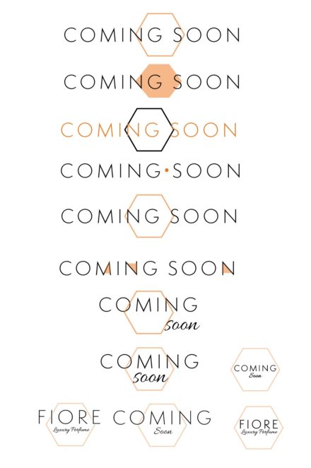
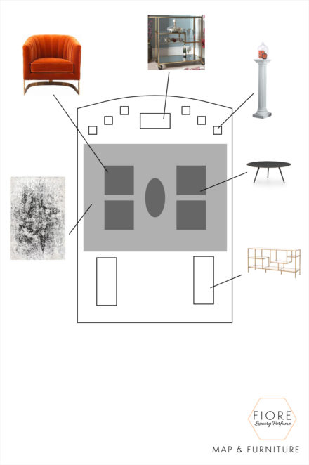
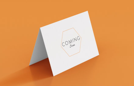
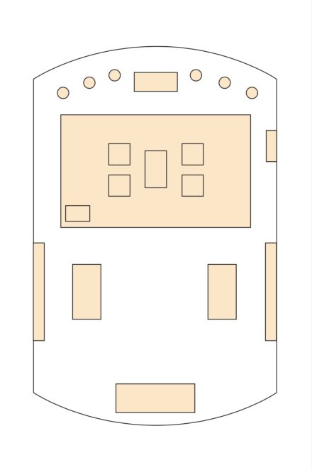
I ended up choosing the space with curved walls because the custom build of it would add to the feeling of luxury this brand was meant to embody. From there I began looking for the different furniture pieces that would be in the space, began to finalize the layout of the store. I went through and made a to scale map of the space accounting for furniture sizes. I then continued to work on both types of displays for the store, the regular perfumes which would be sold normally in cases and the exclusive ones which were to be displayed on columns like in a museum. Then came the question, what is under the glass covering when the perfumes are sold out so that they don’t sit empty and feel incomplete. This led to an exploration of the branding of the store itself and how that would lend itself to a card that could sit under the domes and denote that there were more perfumes coming soon.
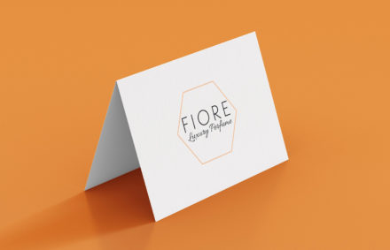
These initial concepts came off as too busy and didn’t capture the elegance I wanted for this brand and that my persona desired so I decided to keep the design element of the hexagon to build off of and moved the brush script to be a more secondary typeface. I dropped the orange saturation for this application as well to add to the feeling of airiness and keep it from being overwhelming. This led to the final card design and logo of the store, now named Fiore.
Completed Project Work
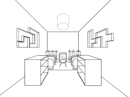
I then added the furniture I had chosen for the space to the map of the store and created a one point perspective drawing to show how it would look when customers walked in the front door. This store was created so that people like Beth are able to shop at a local business in NYC, expand their perfume collection if they are as passionate about it as she is, and allow for a space to comfortably browse and shop.
