People Driven Design – Fairbanks Air Show

With the intention of designing for a specific persona, I focused on the wants and needs of a 16-year-old male from Fairbanks, Alaska in 1925 who has a passion for space travel. From this information, I designed an air show and “introduction to space travel” exhibit.
Process Work
I was really inspired by the art styles of this time and bringing them into the environments. The cubism movement was a big inspiration for this project and I wanted to make sure that the experience of cubism was relayed in more than the second dimension.
I started by creating style boards and trying to find typefaces and colors that had the essence of the 1920s and America without being the typical red, white and blue and art deco style. From there I narrowed down my deliverable ideas to a poster, ticket, entranceway and enclosed space exhibit.
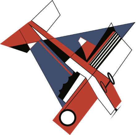
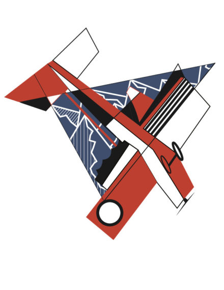
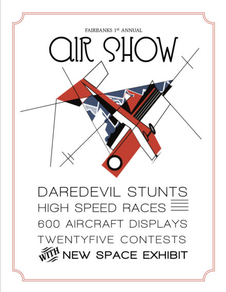
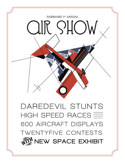
I started with iterations of an airplane illustration that was heavily inspired by the choppy and geometric style of cubism. After finishing the overall composition of the illustration, I wanted to make sure I wasn’t forgetting a huge part of the persona and event; that it was taking place in Alaska. A huge part of Alaskan culture is their gorgeous scenery, mountains specifically. I went back to revise the illustration to include mountains in the background of the plane. I then applied it to my posters paired with the type set typography normally associated with a printing press since that is how they printed posters in the 1920s.
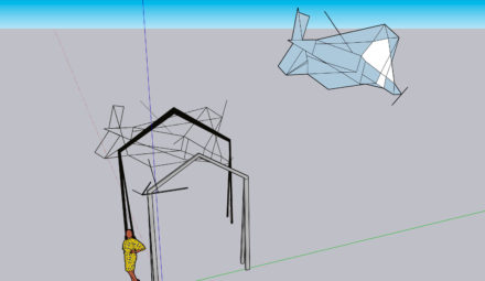
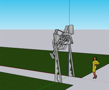
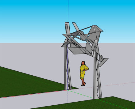
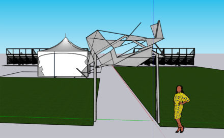
After that I wanted to start experimenting with Google SketchUp to create a 3 dimensional version of the airplane illustration. This way, the people at the airshow could really be immersed and see cubism in a new way. I hadn’t used Google Sketch Up in several years which proved to be a point of difficulty for this project. However, I retaught myself tips and tricks that made the process ultimately a successful one.
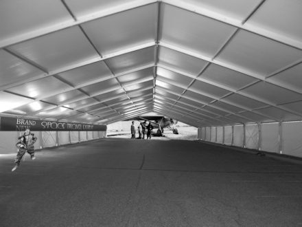
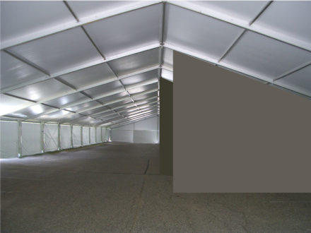
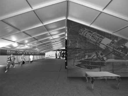
The space exhibit environment was a really big aspect of this project since it was meant to be a huge attraction for the attendees. Most people at this time had never experienced space, or see it other than in a newspaper or book. I wanted to incorporate the immersion idea by having this exhibit be a type of persuasion device to encourage younger kids to go into the field of air travel whether that be an astronaut, scientist or just a pilot. I wanted to add space textures and images of the new space technology to the walls so that the children who walked through could imagine that they were in space or working with the equipment in the hopes that that could spark a passion.
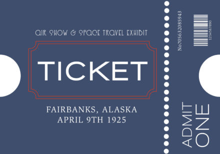
Lastly, I wanted to create a ticket since that would definitely be something needed to enter the event in the 1920s. I applied the branding from the poster to a small ticket to add a holistic sense to the event.
