People Driven Design: Guide to the Spirits San Juan

For this project, we were charged to use a persona to fully drive a design in three different ways. The persona that I received was a 30 year old Puerto Rican male who resides in San Juan in 1965 and is interested in cocktails. For the purpose of this project, I decided to name him Luis Gomez.
Since Luis is interested in cocktails, and was of upper middle class status, I thought that it would be interesting to provide both an in person experience where Luis could learn about different cocktails created in the city as well as an at home experience where he would be able to apply his cocktail experience the comfort of his own home. My goal for these designs in relation to Luis is three fold; recognize the Guide to the Spirits brand, respond to the action steps set fourth by the brochure and go out to explore the spirits of San Juan guided by my signage, and lastly to re-create the cocktails that he was able to experience with the help of my coasters.
Process Work
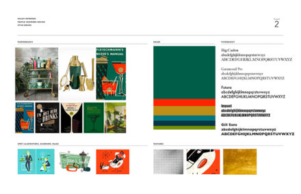
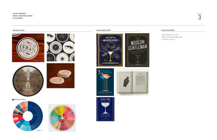
I decided to name this guide and experience “Guide to the Spirits San Juan.” I chose this name because I really liked the idea of incorporating latin culture (the mystical, spiritual side) into the name. Being a hugely religious culture I thought this name would be a clever take on the religious concept. I then took that idea and ran with it. Since Luis is residing in the year 1965 I really stuck with the layered flat graphic style that was very prevalent then. I also pulled in some brighter colors that reflect the colorful world of Puerto Rican Culture in order to execute my designs. The goal in creating this guide and experience is to empower Luis to explore the possibilities of cocktails in his city, experience what the Guide to The Spirits San Juan has to offer, feel empowered by his experience to then execute cocktails on his own at home.
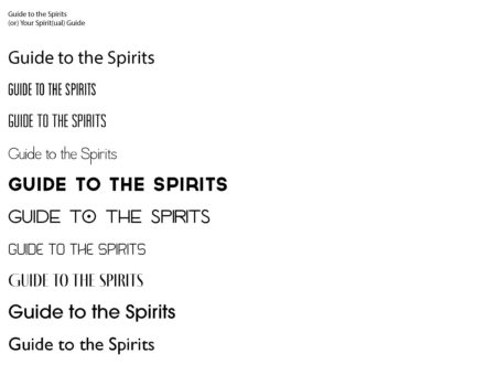
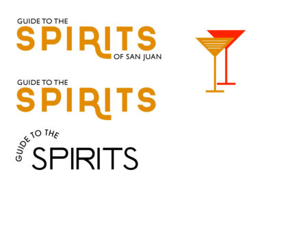
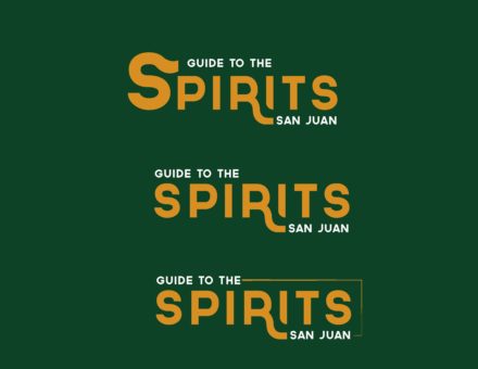
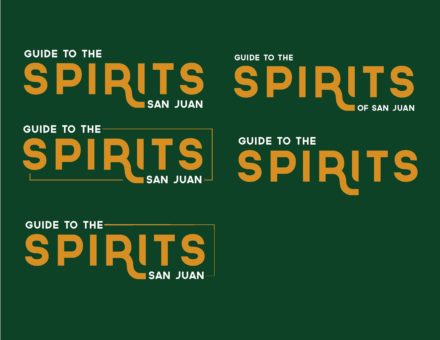
I worked really hard on getting the logo just right. I used the font Governor for the logo, and I think that it was a great choice because it conveyed a sense of vintage latin culture. I wanted to create a sense of movement, so I created the logo to reflect that with the descender on the “R” as well as the little clipping of the “I” to echo the movement of the “R.” As for the actual collateral pieces, I designed a booklet that would be the initial touchpoint for Luis, signs that would give Luis a visual cue that he is at a Guide to the Spirits San Juan Location, and coasters that would sit atop the drinks that he would later consume. There are ratios of the ingredients in the drink on the back of the coasters so that he can take them home to try to recreate the drink himself. I created icons that are placed in the booklet that give Luis an idea what the drink is like before he even steps foot into the bar that the drink resides in, and I designed them in a way that conveys the 1965 era that he resides in. I also explored the idea of coordinating colors with each drink and location to create a unified system of elements that allows Luis to navigate the guide and experience the locations in unison. All of these elements would help Luis explore the vast world of cocktails and empower him to try to make his own drinks at home. My hope is that this guide would be a launching pad of inspiration for Luis to continue his cocktail passion.
Completed Project Work
All in all, I believe that this would be the perfect experience for Luis to get out and experience the city that he lives in while also getting to explore the world of cocktails in his city as well. He would benefit from the cohesiveness and the intention put into each step of the tour that I created thus empowering him to become more comfortable with experiencing his city and also making his own cocktails at home. below are the final deliverables for Guide to the Spirits San Juan.
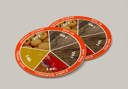
Coasters back. 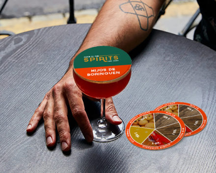
Coasters in space. 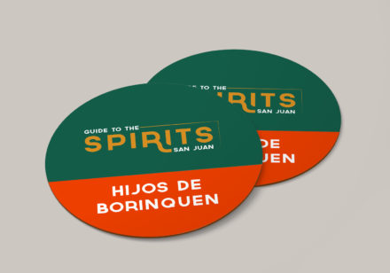
Coasters front. 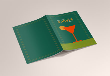
The front and back of my catalogue. 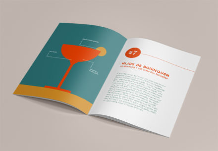
The inside of my catalogue. 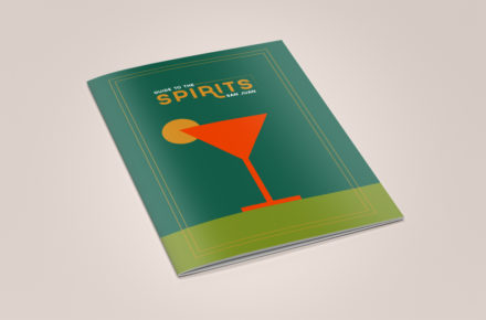
The front of my catalogue. 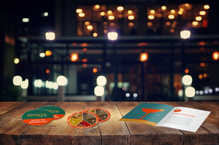
All collateral pieces mocked up on a bar. 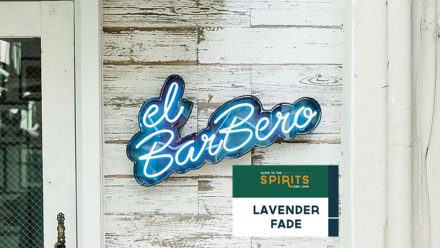
Signage outside of a bar
