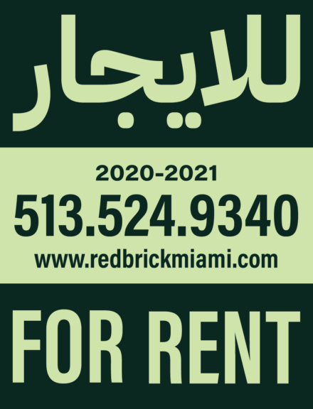
Case Study – Arabic Type Outdoor Signage

Project Description
For this project, we had to find a pre-existing design and create a new, bilingual version of it. The two languages we were tasked to include were English and Arabic. The biggest parameter is that our fonts had to match (or be close to) the font used in the original design; this meant finding an Arabic font with similar characteristics to the Roman font. We also had to keep all the written information, including a translation of everything that could be translated. Otherwise, our designs were allowed to be as similar to or different from the original as we chose.
Who Was Included
The majority of this project was just me. At different stages of the project, my classmates and professor were able to give me feedback on my progress. At a later stage, a guest was brought in that was able to give us feedback on our translations, including feedback on our design’s legibility and our treatment of text.
Research
A lot of the research for this project came before I began working on it. For class, we were given readings that discussed the lack of Arabic typefaces. One of the big problems with Arabic type was that the first typefaces were made by designers that were not familiar with the Arabic language, thus they did not function properly. Nowadays, more typefaces have been designed (though they are still dwarfed in numbers by the vast amounts of typefaces for the Roman alphabet) and they seem to fall into one of two categories; the first category is more traditional and was created to look like calligraphy with exaggerated flourishes and a great contrast between thin and thick strokes. The second category is more modern, with less stroke contrast and an attempt to make characters more uniform. Overall, the main details we had to keep in mind was the Arabic type had a history of being difficult to read, there are few Arabic typefaces, and Arabic typography has to be handled by different rules that Roman alphabet typography.
Design Approach
I started this project using the same dimensions, same colors, similar layout, and a near identical treatment of type to the original. The major feedback I received was concerned with which of my designs was best organized (in both the aesthetic and practical sense), though I realized from looking at other peoples’ process work that I could be more creative with my iterations. Perhaps the most interesting challenge was attempting to put a right aligned title with a left aligned title in a way that was interesting, but not overwhelming.
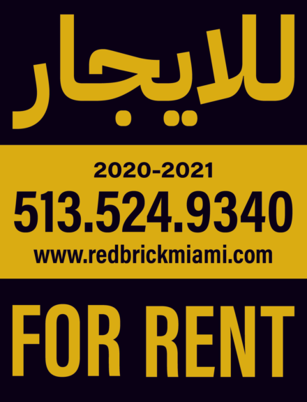


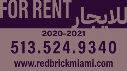


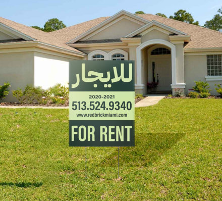
Final Deliverable


Reflections
I think the best part of this project is that you can see how much or how little a design can change to be more accessible. Naturally, this design is able to break past the barriers of the domination matrix because it caters to individuals that can read Arabic and many of the categories (such as age and religion) are not directly relevant to/affected by the design. With technology, universal designs are right around the corner; one could use imagery and icons to communicate the intent or a design and incorporate a QR code (or similar technology) that the viewer could scan to take them to a translation/information page in whatever language they could want.