Case Study: Betty Crocker Zine
Instructions
Your final case study should share the story of your project from start to finish and should include several elements you defined, researched, and created over the semester.
Each of the blocks below is currently hidden. Remove the “hiddentext” class in the “Advanced” block field on the right side of this page to reveal each content block before you publish your final case study. Otherwise, your text will not show up.
Before you publish: change the title of the page and the permalink to your project title.
Delete everything in the instructions block before you publish the page.
Project Description
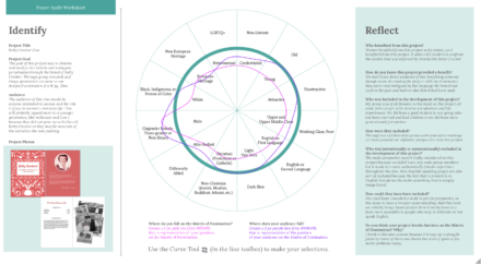
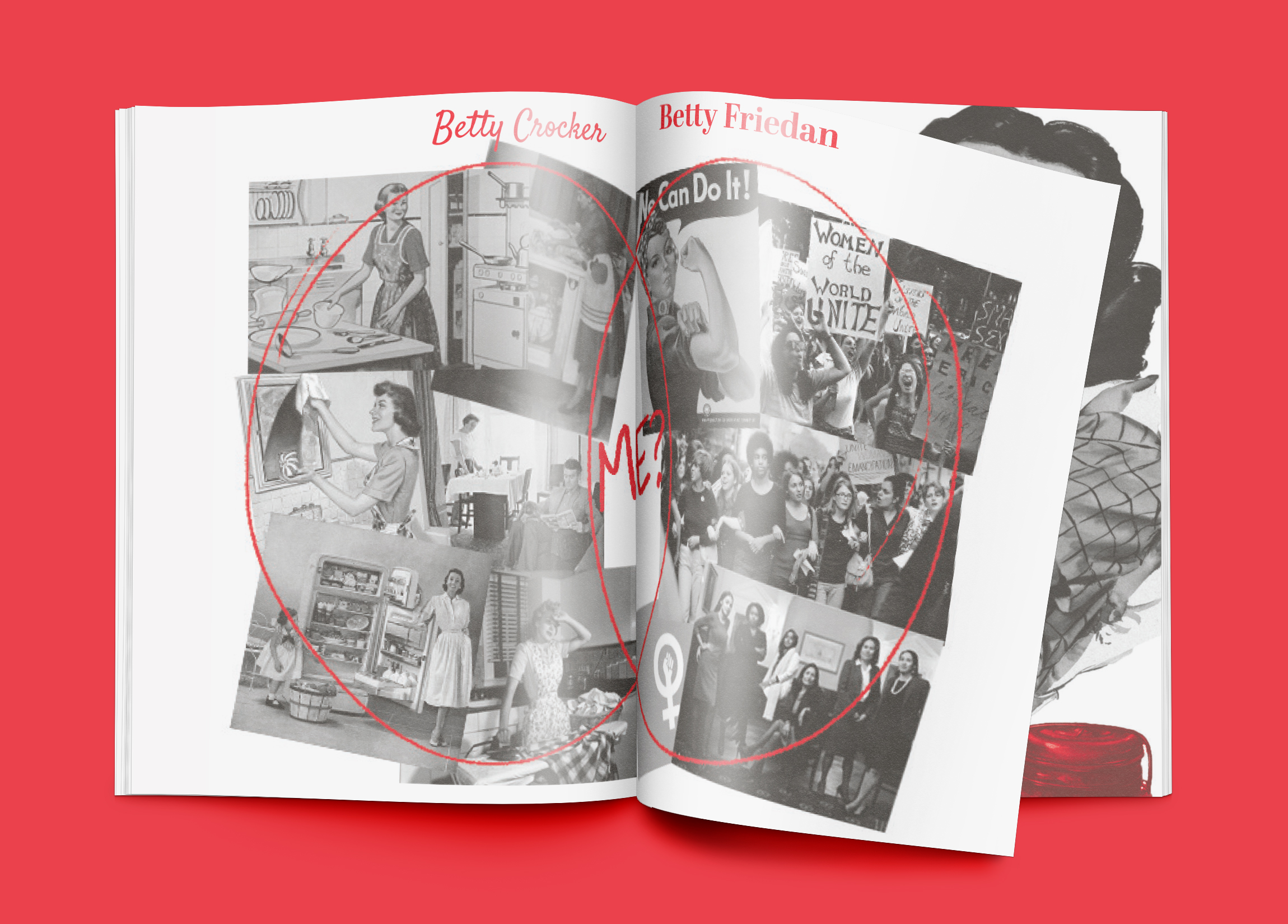
We were given a brand that has been established for a decent length of time and had to analyze their legacy. A brand that has been around for as long as Betty Crocker has will have had to adapt itself to the changing times. Over the course of this time their messaging has changed dramatically so we looked to the past’s sexism and misogyny perpetuated through their brand. Researching this topic led the group research and image generation we came to our designed conclusion of a 16 pg. Zine meant to inform the reader of this legacy.
Who Was Included
Our group for this project consisted of Emilie Abrams, Gracie Glickman, and Coleen Sallot; communication design undergraduates and a graduate respectively. They were all involved in the research of the zine and the following image development. This zine was created for an audience interested in sexism and for those uninformed on the past of Betty Crocker like I was before the start of this.
Research
The beginning of our research was looking into writing materials about the brand and its history. We looked at academic research of the implications of the original Betty Crocker cookbook and the messaging put forward in it. We also looked to consumer reviews and letters written to the fictional character of Betty Crocker to see the perception of the brand to the consumer. After this we looked into the imagery of the brand including advertisements and images from the original book. Taking the insights of the inherent sexism of the brand and the misogynistic materials produced by their advertising team and put out to represent them.We discovered that the messaging of the brand was meant to influence the women reading it to believe that they should be fulfilled by the at home lifestyle and act subservient to their husband. Even in a book of recipes had commentary on the clothing they should be wearing and their duties for cleaning the house. It stepped beyond the kitchen and the character of Betty Crocker became an early version of an influencer, giving advice on any and all topics.
Design Approach
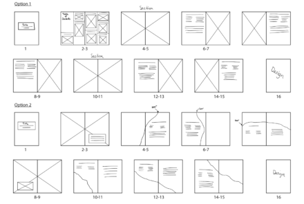
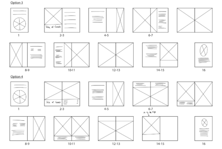
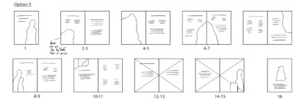
We began the design process by wireframing the pages with possible layouts of the zine. We came up with many different options for the content to be displayed varying from very structures to much more fluid and ambiguous forms.
From these possible solutions landed on the layout that echoed a cookbook the most in order to fully parody this product. We took the way the information was presented and appropriated the format to fit our solution. Option one falls most closely into this formation so most of our pages are based on this configuration.
Final Deliverable
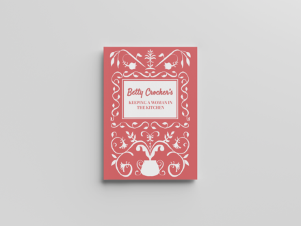
Cover of the Zine 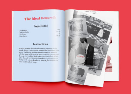
Gebhart Pages 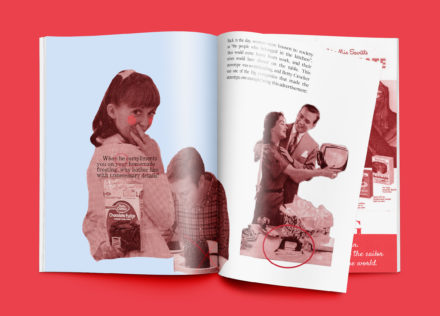
Glickman Pages 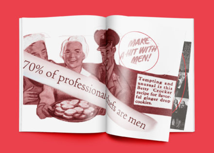
Glickman Pages 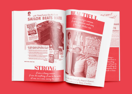
Sallot Pages 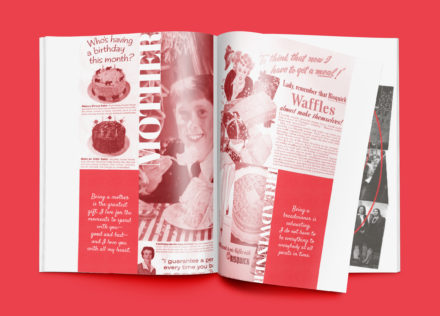
Sallot Pages 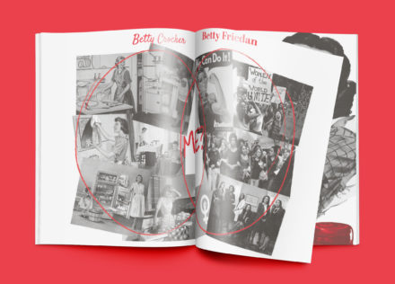
Abrams Pages 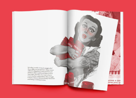
Abrams Pages 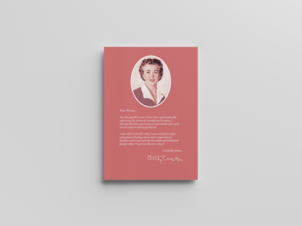
Back Cover of the Zine
Reflections
This project was very successful in demonstrating the sexism integrated into the brand of Betty Crocker. It takes the imagery and appropriates it, taking a new stance on the traditional cookbook. This project was meant to appeal to women who are usually not considered in the design of certain products. They are targeting but not considered in the decision making process which breaks down the barriers in the Matrix of Domination. It brings to the forefront some issues which may have not been noticed otherwise and had gone unobserved by the casual consumer.
