Case Study: Betty Crocker Zine

Project Description
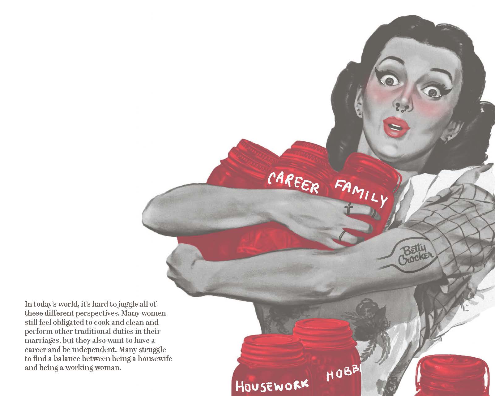
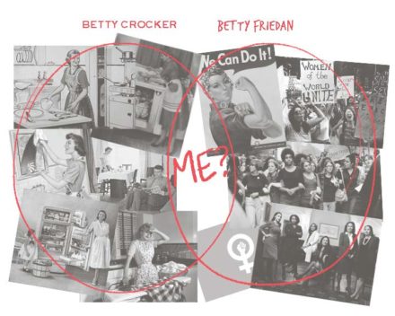
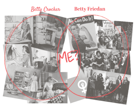
For this project, we we challenged to create a zine as a group about a large brand that we were assigned. As an added challenge, we were only allowed to use 2 colors for our design. My group was assigned Betty Crocker and after doing some research we learned a lot about how the brand carries the very stereotypical traditional women’s roles, despite the brand no longer having a mascot. We decided to center our zine around feminism, post-feminism, and how these ideals work for women in today’s society. We took Betty Crocker imagery and subverted it to show this concept.
Who Was Included
Our goal was accomplished with the help of many people. First of all, I worked collaboratively with 3 classmates, Gracie, Cassidy, and Coleen. Before we started, we met with Stefanie Hilles, an Art and Humanities Librarian at Miami University, who taught us more about the history of zines and appropriation. We also got feedback on each iteration from our classmates and professor.
Research
We began by reading through scholarly articles about Betty Crocker online. There we learned of when the company started and how it perpetuated the housewife role in the 1950s. This impact still lasts to today. I also learned about post-feminism, which I hadn’t heard of before. Post-feminism is holding both feminist and anti-feminist ideals simultaneously. Post-feminists feel should be equal to men, but often feel some internal urge to also uphold many traditional roles in the household. After this research, we met with Stefanie Hilles who taught us about the history of zines and their purpose. I learned about appropriation and subverting images. Appropriation is taking already made images and subversion is taking those images and changing them in order to change their meaning. She showed us many examples of this to help us get an idea of how to approach our own zine.
Design Approach
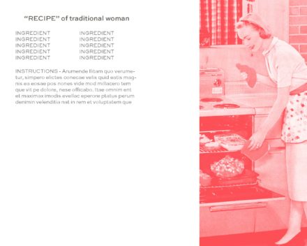
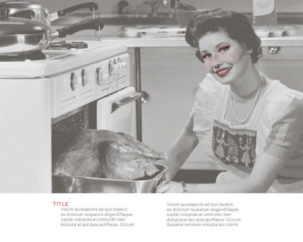
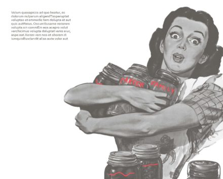
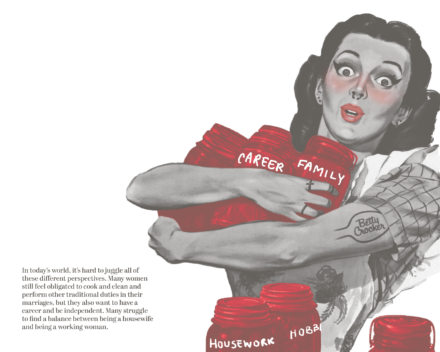
We decided to model our zine somewhat on an old Betty Crocker Cookbook. We began designing our zine by creating digital roughs to get an idea of the style and aesthetic we wanted to use. I wanted to focus on the post-feminism aspect because I found that to be the most interesting and I felt like it applied to me most. I experimented with recipe layouts. In many of the zine examples we were shown there was lots of drawing over images, so I also experimented with that in Photoshop. As a group we discussed how to combine our different styles and aspects of each design we liked. The group really liked the written on/graffiti effect of my images, so I continued to pursue that. After that, we worked on sketching layouts and possible orders of pages for our whole zine. This I found to be somewhat helpful, but it was a little challenging since we were unsure of what all of our final pages would look like yet. We each then refined our roughs and shared that with the group. For my refined images, I combined the drawn on makeup from one image and the written on jars from another to complete one of my spreads and for my other one, I only swapped out some of my “generic housewife” images for Betty Crocker specific ones to keep it more cohesive. In the end, I’m really happy with my final results and I had a lot of fun playing around in photoshop and seeing how I could change images to change their message.
Final Deliverable
Reflections
Some of the successful aspects of my designs I think, are the high contrast I was able to achieve with the red and black being separate monotone images, instead of using them both in duotone, and I think I got my message across clearly using minimal text. Things I may do differently if I were to redo this project would be to maybe add more tie in to Betty Crocker in my layouts or even just in the text. I feel like I only briefly mentioned it or used it as a jumping point to talk about something related. I think this project is important because it reveals some of the deeper connotations and messages of the Betty Crocker brand and it also makes you wonder how many other brands have questionable histories and messages. Overall, I believe this project was pretty inclusive. As far as the Matrix of Domination, the only groups left out were the Non-literate and people who have English as their second language. With the format of the project, I feel those groups would be difficult to include, aside from using more imagery and creating versions in different languages.