Case Study: Design Project – Type

Instructions
Your final case study should share the story of your project from start to finish and should include several elements you defined, researched, and created over the semester.
Each of the blocks below is currently hidden. Remove the “hiddentext” class in the “Advanced” block field on the right side of this page to reveal each content block before you publish your final case study. Otherwise, your text will not show up.
Before you publish: change the title of the page and the permalink to your project title.
Delete everything in the instructions block before you publish the page.
Project Description
In your own words, write an overview of the design challenge, approach, goal, outcomes, and any other important insights that you found interesting about this project. (approximately 100 words)
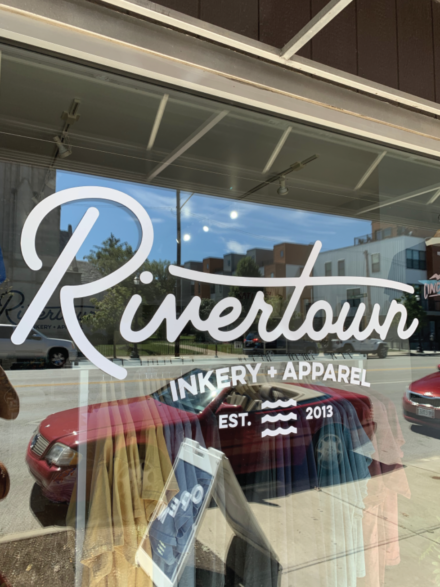
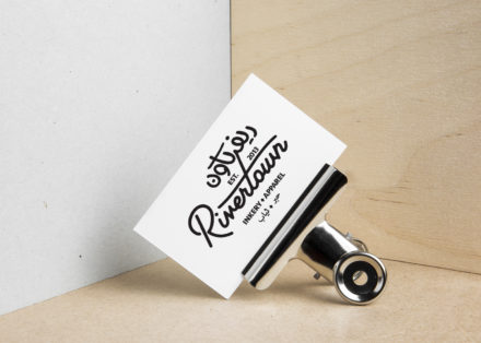
The focus of this project was to become aware of the lack of Arabic font choice that exists today. My job was to choose a Latin alphabet design that would then be integrated with Arabic calligraphy in a way that is cohesive and legible in the same style of the original design. The process began with research to understand Arabic typography and fonts, making sketches, choosing a font, and creating a final design. The goal was to create a new design that would incorporate Arabic typography as well as the Latin language to produce a new design that opens up to a new audience for those who read Arabic. This new design would exhibit clear legibility and consistent style among both languages.
Who Was Included
During the development of this project, I consulted fellow classmates, my teacher, friends, family, and a designer named Miriam Salah who was designer fluent in Arabic. My role was to research and design the final logo. Since I don’t read or speak Arabic, it was difficult to see what would be legible or not. Miriam’s expertise was priceless during the design process.
The audience of this design was for young adults who read using the Latin alphabet or the Arabic alphabet.
Research
Research played a major role in making this project a success.
My secondary research included reading the assigned articles such as “Arabic Type Design to Experience an Awakening” by Margaret Rhodes, “Cultural Considerations: Arabic Calligraphy and Latin Typography” by Sherry Blankenship, and “The Politics of Arabic Type Design” by Nadine Chahine. These readings greatly broadened my knowledge and understanding of Arabic calligraphy and how it differs from the Latin alphabet. Something that really struck me was how limited Arabic designers are since they don’t have many updated fonts to choose from. In addition to this, I was saddened with the thought that even though there are many people who speak and read Arabic, there aren’t many Arabic translations or integration of their written language in most advertisements in our society. I also gained insight from looking into other examples of Latin alphabet and Arabic alphabet integration through logos and how the style and aesthetic can be consistent while the same message is in different languages. The most powerful research that heavily impacted my design direction was meeting with Miriam Salah to discuss my design drafts and how to keep the same message while also focusing on legibility and clear identification. This primary and secondary research helped me design a piece that fulfills my goal of integrating Arabic calligraphy and Latin typography in a cohesive and clear way.
Design Approach
I started my iteration by drawing small thumbnail sketches of the design layout. After the initial layout sketches, I searched for a similar font as the original . Next, I created 10 rough drafts of the logo before meeting with Miriam Salah to discuss changes that I should make for the final designs.
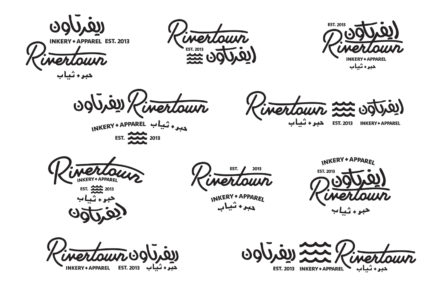
After meeting with Miriam, she pointed out some things that were very beneficial in the legibility from her point of view.
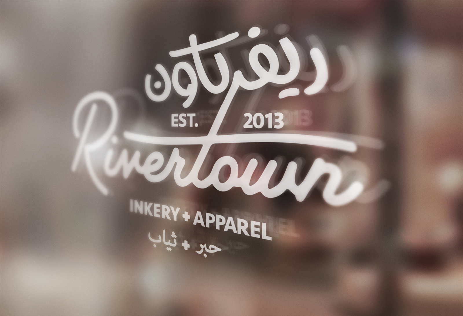
The Arabic word for "Rivertown" is "ريفرتاون."
Miriam had pointed out that I had elongated the end Arabic character in that word to make it look consistent with the rest of the word. However, this distortion also made it confusing for Arabic readers as it reads to be a different character and therefore a misspell. If I had not learned of the mistake, I would have ended in creating a design that would be completely useless for the goal I was trying to achieve.
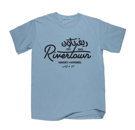
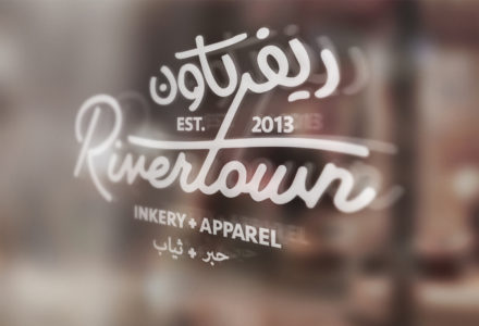
Final Deliverable
Reflections
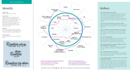
Use this section to elaborate on the successful aspects of your process/project that you would repeat or things that you would do a little differently. Consider the following questions: Why was your project important? What tools, methods, or frameworks helped you work through the project? How might others get involved in this type of project in the future? Additionally, discuss your Power Audit Worksheet here and how you felt your project helped break barriers on the Matrix of Domination. Include an image of your completed power audit worksheet. (approximately 100 words).
This project was challenging and eye-opening. Finding a font that matched the original style of the design was a struggle because of the lack of Arabic typefaces. Meeting with Miriam Silah was so beneficial in the production and success of this piece. If I had not met with her, I would have not learned the mistakes of my first design drafts. In hindsight, I would have liked to do more research about the grammatical structure of the Arabic language or met with someone like Miriam sooner.
I learned so much about Arabic typography and how sad it is that it isn’t as incorporated into our design world as it should be. If there was more support for development in Arabic font design, it would be much easier to design for those who read Arabic. It would also benefit more people if there was more integration of the two languages as Arabic-readers could be more involved in our society as they should be.