Case Study: Mrs. Butterworth Zine
Project Description
For the image project we were put into groups and were asked to create a zine on a specific brand and how it supports the dominant culture (light/pale skin, upper middle class, educated, heterosexual, etc). Our group was assigned the Mrs. Butterworth syrup company. Our goal was to inform our audience in an interesting and engaging manner the racist stereotypes that the Butterworth company is promoting through their brand mascot.
Who Was Included
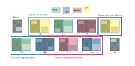
My group members were Erin Hart, Natalie Hopkins, and Lexi Sussman. Each of us were assigned to work on two spreads of the zine and research the company’s history and the stereotypes were used when designing the mascot to create an informative and visually engaging zine. Our audience is a younger generation interested in social issues due to the format that the project will display.
Research
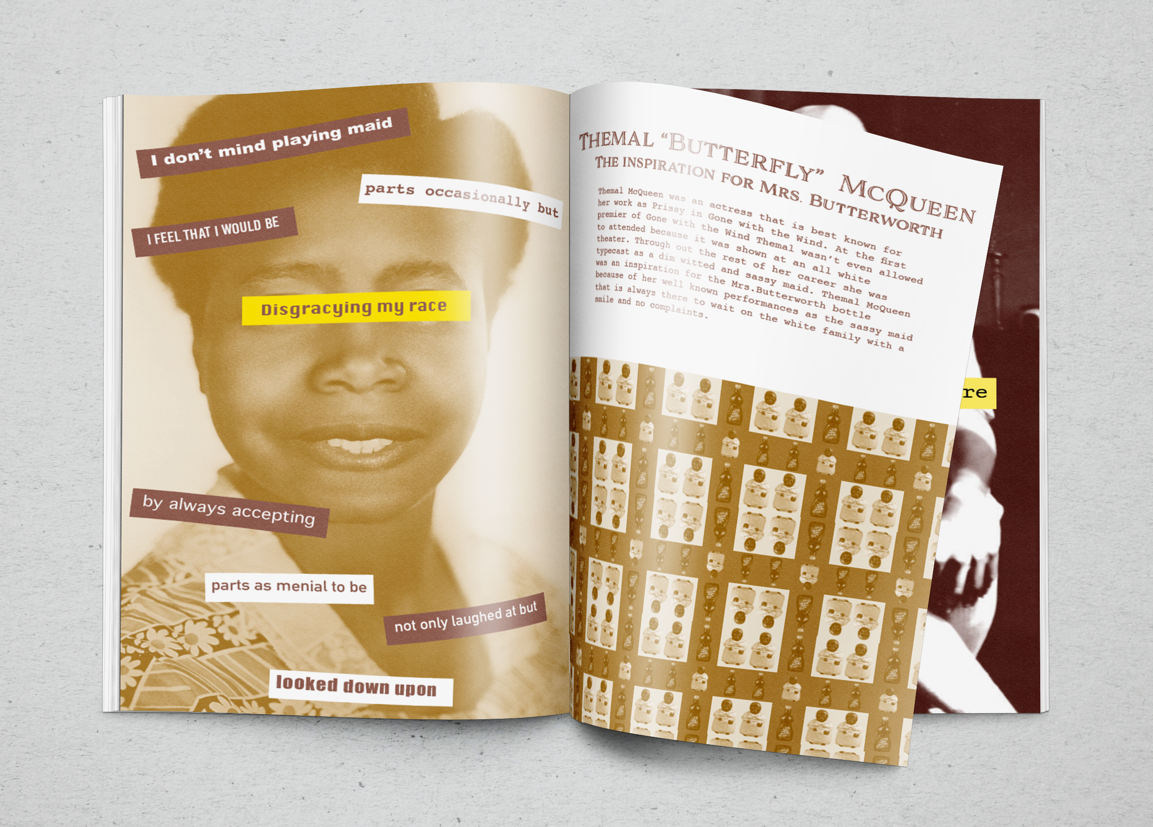
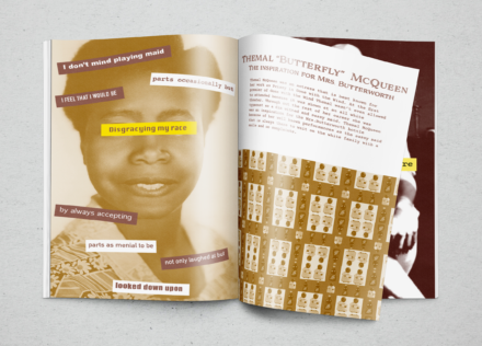
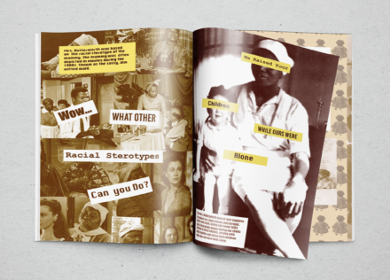
Before the start of the project we were given a slideshow presentation on the history of zines from Stefanie Hills. After this presentation we gained a better understanding of what really makes a zine a zine so we felt ready to dive into our own research about the Butterworth company. We each used the Miami library website to find journals, and articles about the Butterworth company and the racial stereotypes behind the company’s mascot. While doing our research we discovered that the Mrs. Butterworth mascot was based on the famous Gone with the Wind actress Thelma McQueen who played Prissy, the sassy, dim-witted maid. Mrs. Butterworth was also based on the racial stereotype of the “mammy”, a usually larger black woman who would either be a maid or nanny for white families. By having Mrs. Butterworth represents their company the Butterworth brand and not changing it shows their racist mindset. By creating this zine we wanted people to become more informed about the racist stereotypes that many companies still have and to become more aware of the companies they are buying from.
Design Approach
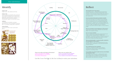
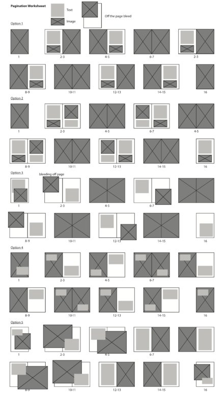
After our research we started collaging images together to get a feel for what the aesthetic of zine will be. After we went through and put a star next to all of the images that we liked for our zine pages. Then we gave each other two spreads to work on based on a certain topic that we researched, for example I worked on cultural appropriation and racial stereotypes. We went through multiple revisions of our spreads to make sure that they didn’t have spelling errors or repeats of collages.
Final Deliverable
Reflections
I think overall the zine turned out pretty well there are some minor things that I would change though I had more time on it. Some of the images on my page don’t align correctly so I would go back to fix that and other minor changes to images and text. I think our project is important because it would open the eyes of our audience to the issues revolving around companies racist branding. This would allow for our readers to become more aware consumers. Hopefully this will raise awareness of the racism in the food industry and inspire other people to share their voice of the injustices that these companies are perpetrating. I really think this project broke down many barriers of matrix domination because it’s for anyone interested in helping stop social justices doesn’t matter race, religion, gender, etc. Though I do admit this is targeted towards younger generations because of the zine format. The whole idea of the zine is to raise awareness of racism in everyday things such as food brands, so the zine was not targeted toward one race instead anyone who is willing to read the zine.