Case Study: Oxford West Redesign (Arabic and English)


Project Description
This project introduced the goal of redesigning a local sign of our choice into a dual-language format featuring Latin and Arabic typography. Ultimately, we needed to combine Western and Eastern thought into a unified design outcome. Because we were not allowed to change the original Latin letter forms, the challenge lied in adding an Arabic typeface without altering the sign’s typographic identity. There are currently far more options when looking at Latin typefaces, so deciding on what Arabic letter forms both stay true to the culture as well as have a natural placement within the Latin context proved to be a difficult task. Aside from this limitation, we were allowed to keep or change as much of the sign’s colors and layout as we wanted.
Who Was Included
I carried this project mostly by myself but received guidance when needed from my professor and fellow classmates. As someone who cannot understand the Arabic language from any point other than that of an outsider, I also required the feedback from a native Arabic guest speaker to correct my translations and provide feedback on letter manipulation. Without her help, I would not have been able to cater to my audience of literate Arabic speakers.
Research
We were assigned several readings in preparation for a basic understanding of Arabic thought in typographic design. By reading Cultural Considerations: Arabic Calligraphy and Latin Typography, I was able to understand how typography is not only about legibility, but is an “embodiment of a culture’s identity”. Knowing what the differences are between Western and Eastern thought can open more appropriate possibilities when making design choices with multiple cultures in mind. With the help of Harmonization of Arabic and Latin Script, it was made clear that there is an issue with too much Western influence when creating Arabic typefaces. This reading helped me understand what not to do in my own design through provided examples that were considered unsuccessful Arabic typefaces based off of preexisting Latin ones. A Rosetta Type Blog article, A brief overview of the various Arabic calligraphic styles, provided me with the building blocks of some Arabic calligraphic styles and how they relate to modern Arabic typography.
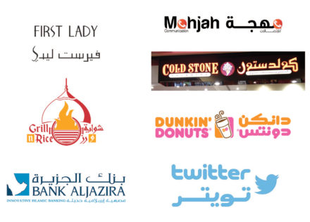
Once I had this tool set, I did some visual research of other bilingual signs that included Arabic and Latin forms. This step really helped me gather a better understanding of where I’d like my design to go.
Design Approach
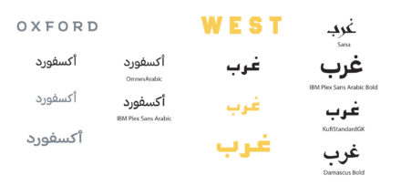
The original sign I used was very simple but had a strong brand identity as an apartment complex (Oxford West). In order to add the Arabic elements, I took a lot of inspiration from my visual research examples. Much of my time was spent inspecting the details of my Latin typefaces and figuring out what existing Arabic ones matched appropriately. After deciding on my typefaces, the feedback I received had a big impact on my iterations because I had unknowingly been working with an incorrect Arabic translation and manually manipulated the font too much.

Throughout my drafting process, I made layout iterations that were both similar to and very distant from the original sign, but in the end, I chose to implement Arabic into the original sign as naturally as I could.
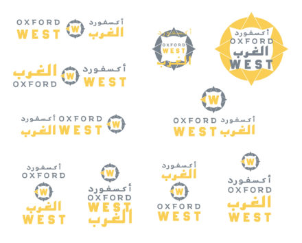
Final Deliverable


Reflections
This project was very valuable to me as a language learner, and I believe more people should have experiences like this. However, that doesn’t mean I have much confidence in my design outcome. Working with a language that I could not even try to articulate by only seeing the written forms challenged me to wonder what the limitations are for manipulating typographic form that I don’t fully understand. Because of this, I’m still unsure of how successful my design is – even with the help of an Arabic speaker. If I could go back and have more feedback from an Arabic-speaking audience, it would boost my confidence.
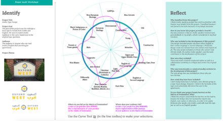
In my Power Audit Worksheet discussing the Matrix of Domination, I mention that this project could break barriers on the matrix because the design does not necessarily require any English, non-native or otherwise, in order to be useful. Someone who speaks only Arabic should still be able to read this sign just as well as an English speaker. If my design does accomplish this, then I’d consider it a success, and if it doesn’t, well at least I learned something.