Project Description
The objective of Design Project: Type was to redesign a type specimen from my local neighborhood for a dual-language format using Latin and Arabic typefaces. This project was very enlightening in the sense that it led me to consider culture, language, and typography in completely new ways! Before this experience, I had a very limited understanding of Arabic text (I knew that it was read right to left and that some styles were more traditional than others) and had no idea how few Arabic typeface options there are (1,000 times less than the ~100,000 of Latin languages).
Who Was Included
This piece is designed for anyone who can read, but the more socially progressive message likely resonates the most with teenagers, Gen Z, and millennials. I would say that literate English and Arabic speakers would benefit from this project, as the goal was to create a sign that legibly got the message across in both languages. I benefited from this project by learning about Arabic typefaces and the importance of merging elements of different cultures in design.
Research
My research for this project began with reading and discussing the articles, “Arabic Type Design to Experience an Awakening,” by Margaret Rhodes, “Cultural Considerations: Arabic Calligraphy and Latin Typography,” by Sherry Blankenship, “The Politics of Arabic Type Design,” by Nadine Chahine, “A brief overview of the various Arabic calligraphic styles,” by Rosetta Type Design, and “Harmonization of Arabic and Latin Script,” by Titus Nemeth.
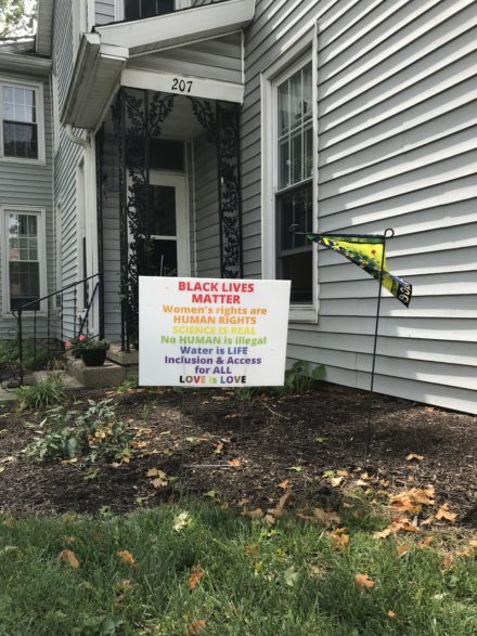
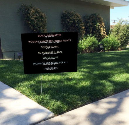
I then found a type specimen in my neighborhood that I thought would benefit from redesign.
From there, the design process began. I had to learn how to enable Arabic fonts on my computer, then completed 10 digital roughs.
Next, I participated in a collaborative studio workshop with open reviews from designer Miriam Salah, who is fluent in Arabic, about our project progress. She provided extremely helpful suggestions and guidance relating to legibility, cultural context, and typeface selection in regard to the 3 rough drafts I selected to show her.
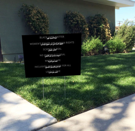
Finally, refined my work to 3 final deliverables based off of feedback I received throughout the design process.
Design Approach
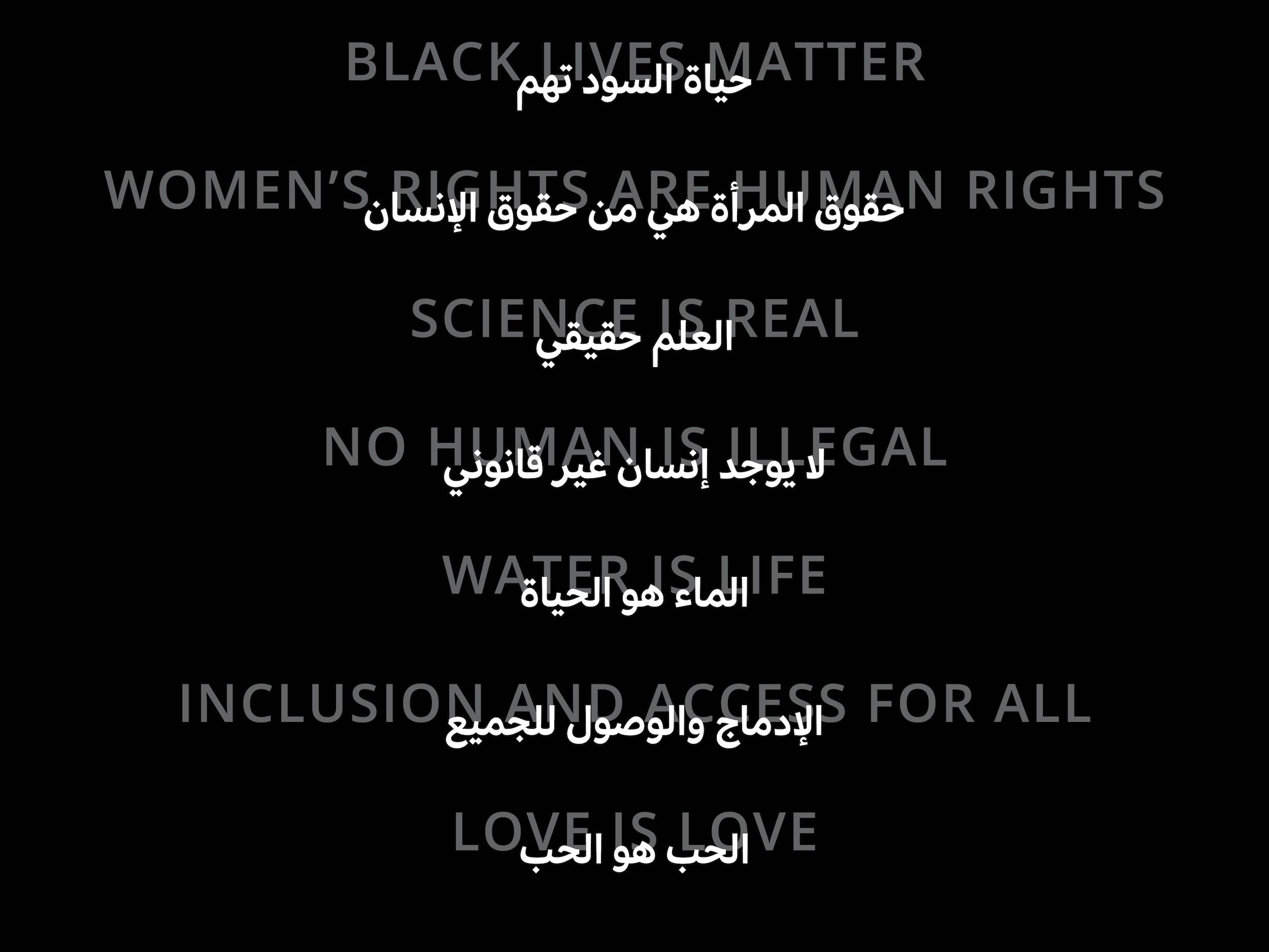
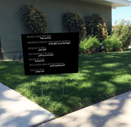
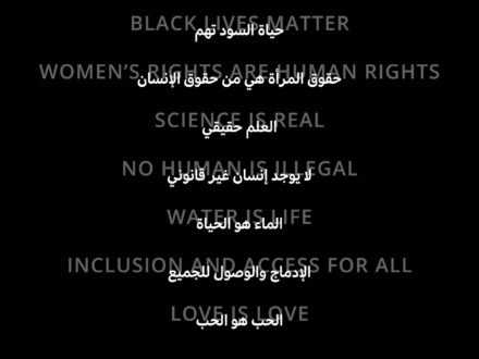
To start off, I copied the original English text from the yard sign, with the only change being each phrase taking up only one line. Then, I found an Arabic typeface I thought paired well with Open Sans, called Adelle Sans. I chose this typeface because it’s simple, modern, and easy to read. Then, I roughly translated each English phrase to Arabic using Google Translate. From there, I got rid of the random uppercase words, then began changing text size, then added colored backgrounds to split up phrases, then tried overlapping text, then mirrored the Arabic and English text. Below are my 18 digital roughs.


I then narrowed down my options to my top 3 digital roughs for the Collaborative Workshop with Miriam.


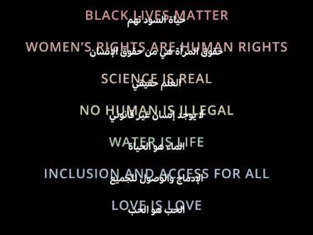
Miriam suggested that I try making an iteration of the first version using color. She also gave me a more correct Arabic translation for “Black lives matter. My professor, Zack, also suggested increasing the opacity of the English text in the first and third versions. After taking this feedback from Miriam, Zack, and my peers, I ended up with my final 3 versions.
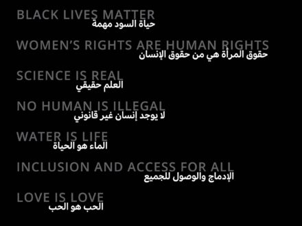
Final Deliverable
Reflections

This project helped me appreciate all the typographic choices we have for the Latin alphabet, as well as the efforts that are currently being made by Arabic designers to develop a wider range of typefaces. Most importantly, I became more familiar and comfortable with the process of combining elements of two very different cultures into one cohesive design, and more understanding of how essential it is to do so thoughtfully, carefully, and respectfully, which will ultimately help me grow as a designer.