Designing with Type: Case Study

Designing with Arabic Type
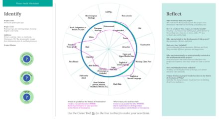
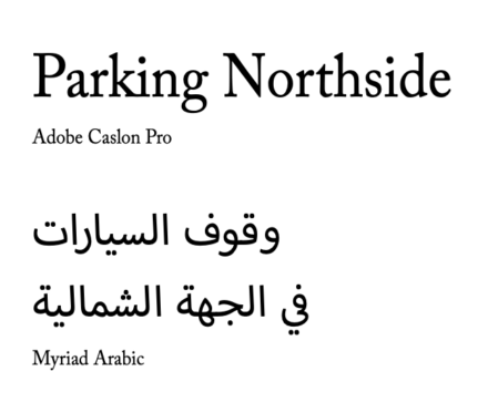
The class was challenged to go into our neighborhoods and find a type specimen “in the wild.” This specimen would then be reimagined to allow for a dual language design solution using Arabic and English. We analyzed the specimen to identify the typography, style, and tone, then selected from the 100 Arabic typefaces to compliant the western typeface. The goal was to learn how to design in dual languages, become familiar with the culture, avoid unintended cultural consequences by applying western typographic rules, and determine the best design solution for “type in the wild.” This resulted in an outcome that would be culturally appropriate for both languages and teaching the importance of researching cultures and sharing prototypes with native speakers of the language.
Who Was Included
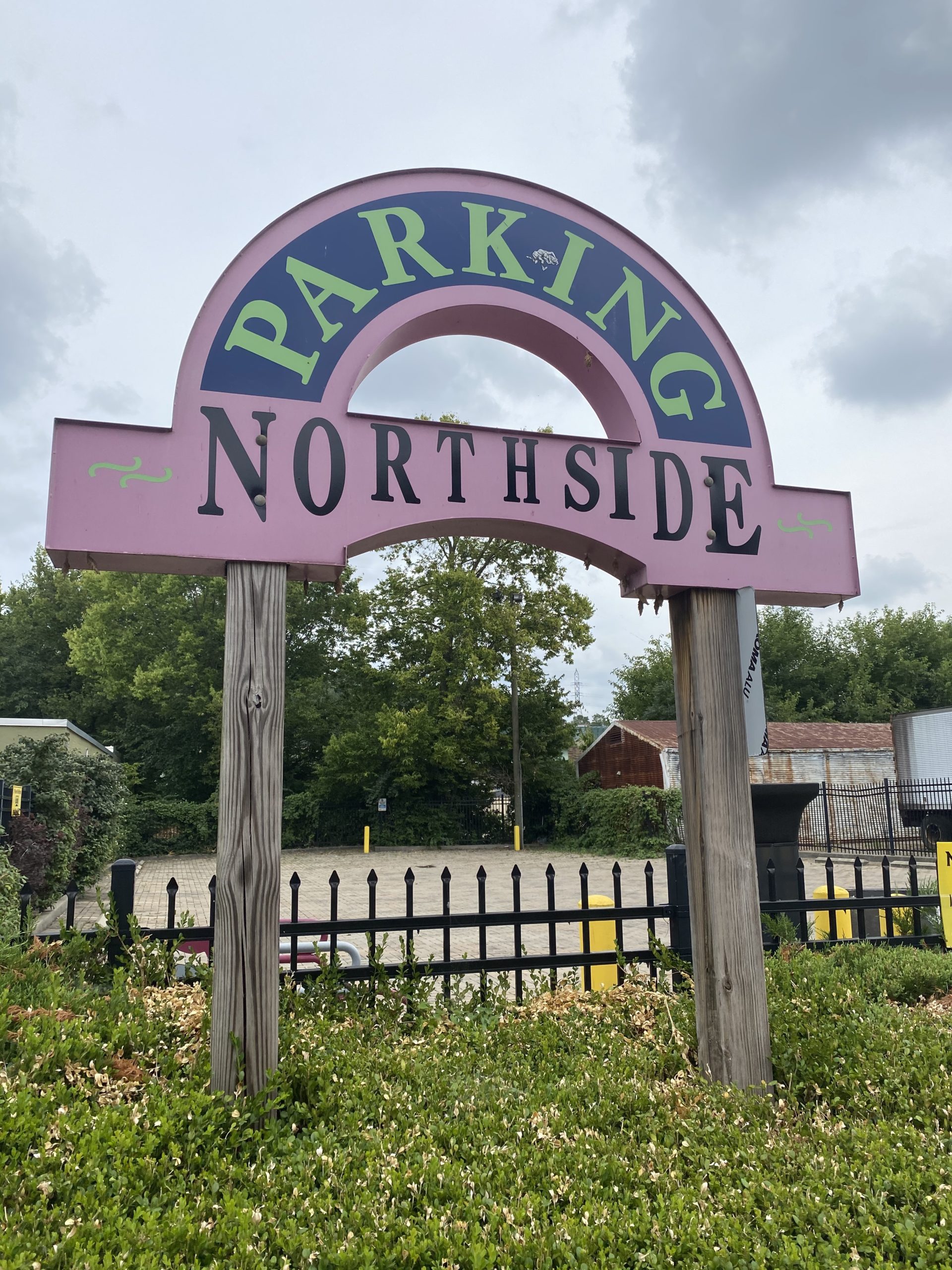
Each classmate was required to find, recreate their type specimens, and provide feedback to others’ work in the class. After the initial design critique with classmates, we spoke with Miriam Salah, a native Arabic speaker and designer. She provided feedback on our designs and provided us translations if Google Translate was incorrect or literal in the translations. Miriam’s critique was an essential step in the design process since the entire class was new to the Arabic language and wouldn’t be able to tell these errors. The audiences were drivers and bike riders in Northside, Cincinnati, OH; those would speak Arabic and/or English.
Research
I completed research by completing the readings and watching the TEDx talk videos assigned. This research made me realize how privileged I am to have thousands of typefaces at my disposal. I never worried about portraying or evoking a tone or style with typography because of the plethora of options online through type foundries or Adobe Fonts.
The two types of typography show how significantly different worldviews between the East and West. The West views life as the external experiences and that we are observers; therefore, typography is used to display the data collected. At the same time, the East believes that life is based on internal experiences, and their scripts are used to show inner thoughts and experiences. Scripts resemble religious text, which is fluid, decorative, and individualistic.
Design Approach
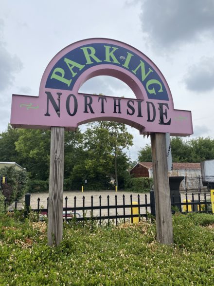
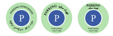
My design approach was to make the signage look more like the universal parking signage, with a blue background and large white “P,” but keep the green and blue as accent colors to stay true to the Northside quirky vibe. I changed the blue slightly and then ran the colors through a color contrast website to ensure a proper contrast between the colors to be accessible for all users.
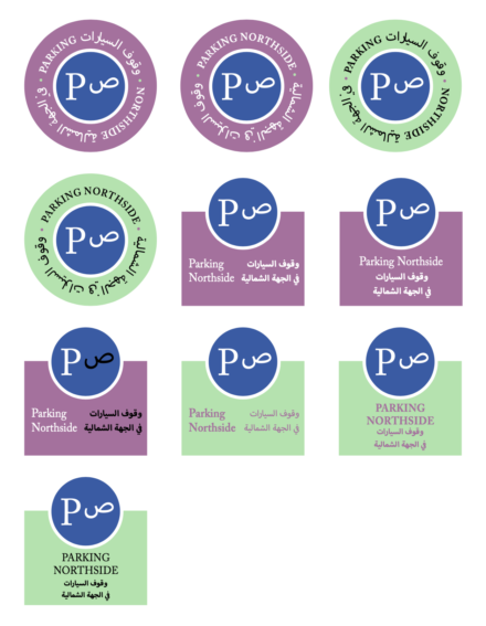
During the critique with Miriam, she suggested removing the Arabic “P” since the “P” symbol is universal, making it redundant. Also, my Arabic type was backward; reading left to right instead of right to left.
Final Deliverable
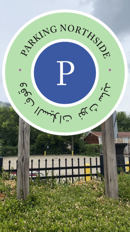
Place images with captions of your design deliverable here. Try to place your design in context using mockups from GraphicBurger, rather than just sharing exported files directly from Adobe Creative Cloud.
If you choose the zine as your favorite project, I like this Magazine Mockup. Feel free to find your own.
Reflections
This project made me think outside the box and think about how design and typography can affect the world. Design transforms everyday experiences for billions of people across the globe. It’s essential to think about all people and break the barriers on the Matrix of Domination. Even small efforts can make an impact and snowball into a movement.