
Project Description
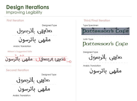
The goal of this project was to redesign a Latin based type specimen to be a dual-language format with both English and Arabic. The Arabic language has very limited typeface options so to expand their access to expressive typefaces I decided to advance this project by creating a new Arabic typeface that matches the Latin font used in my type specimen. One of the most valuable lessons I learned throughout the design process was the importance of detail when working with non-Latin alphabets. With the help of native Arabic speaker Miriam Salah, I gained a comprehensive understanding of how the Arabic letterforms are created in relation to the entirety of the word. It was with her assistance, conducting further preliminary research, and utilizing the iteration phase of the design process that I was able to create a final product that broke the barriers of the Matrix of Domination.
Who Was Included
For this independent project, I made all the design decisions from selecting the Patterson’s Cafe logo for my type specimen to determining the artistic style. During the iteration phase of the design process, I participated in a collaborative workshop with native Arabic speaker Miriam Salah to ensure that my design remained legible and stayed within the Arabic cultural context. Miriam offered some vital critiques to optimize my final product for my target audience of native Arabic speakers who would benefit from the availability of dual language signage.
Research
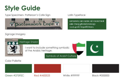
With minimal prior knowledge about the Arabic culture and language, it was important to start this project with preliminary research. First, I read a variety of articles that explained how there is a limited number of Arabic typeface options restraining their creative, expressive freedom. In addition to that article, I also read a piece that analyzed the Eastern and Western application of language and its cultural significance that gives their language power beyond its legibility and aesthetic appeal. These articles helped me understand that due to the strict application of letterforms in the Arabic alphabet it is more difficult to alter the type while remaining legible. Once I had a better understanding of the creation of Arabic letterforms, I conducted visual research to explore existing examples of dual-language Latin and Arabic signage. Lastly, l researched imagery I could incorporate in my design to represent the Arabic culture such as national colors and flags.
Design Approach
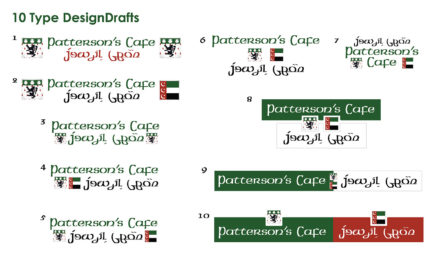
At the beginning of the design process, I made the design decision to expand the bounds of the project guideline by creating my own Arabic typeface instead of using one of the pre-existing options. I felt this would be more beneficial to my target audience because based on my research my design could be used to create a new Arabic typeface and expand their limited options. I started by creating a style guide to use for creative direction for my first 10 iterations. From there I got feedback from my peers to help me narrow down which option I would expand upon. Once I had chosen one, I worked with Miriam to improve the legibility of the type. The images below illustrate my design iterations as I received Miriam’s critiques on how to better manipulate the letterforms and the words as a whole to produce the most authentic Arabic solution.
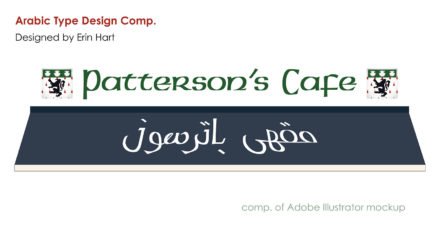
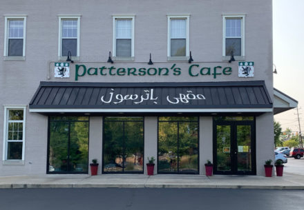
Final Deliverable
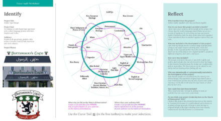
Reflections
I am proud of the results of this project because by converting my type specimen’s Arabic translation into the style of an expressive Latin font I have introduced new typeface options to be used in the Arabic language. Throughout the design process, I referenced the Matrix of Domination to assure my design was inclusive by incorporating dual languages, including cultural heritages by adding both cultures’ coat of arms and applying a broad aesthetic style to appeal to all people no matter their background. While my final deliverables are predominantly inclusive, those with visual impairments could have been more appropriately included if I had incorporated universally understood icons/symbols to communicate the kind of business the sign is associated with.