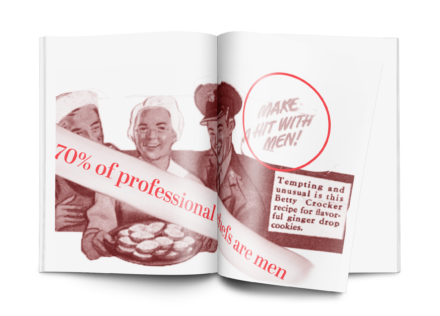
Project Description
The project I am studying is a zine I made with a group of people about a company that is known to have stereotypes. My group was assigned Betty Crocker. This project’s goal was to address forms of feminism and stereotypes within family roles relating to a company as big as Betty Crocker’s. We worked together as a group to research and come up with three themes that we used throughout our zine. For the zine itself, we decided to go with a “cookbook parody” look. The zine had to be duotone, so we used Red and Black Duotones.
Who Was Included
In the development of this project, I worked with three other designers. Without them, I wouldn’t have been able to complete this zine as efficiently, and it was very beneficial for me to have these group members to bounce ideas off of. We decided that our audience is anyone who buys from Betty Crocker, but mostly women who feel as if brands such as Betty Crocker are treating them poorly with their advertisements and what they stand for.
Research
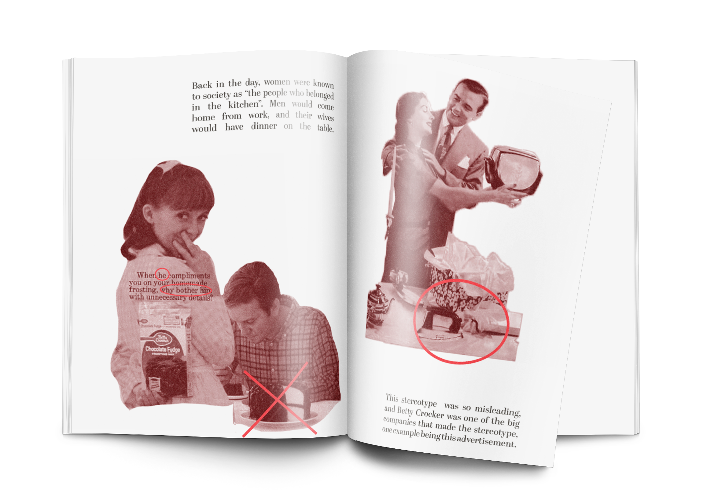
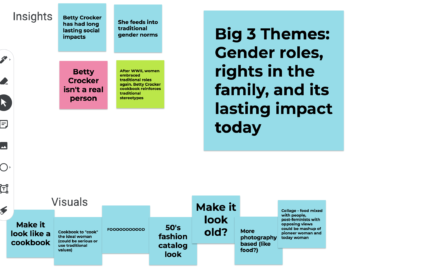
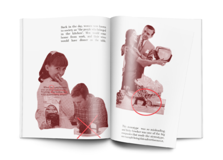
The research for this project was pivotal in making the final zine. I started out by reading lots of articles relating to Betty Crocker and trying to narrow down themes with my group members. After our readings, we narrowed. down to “feminism, family roles and postfeminism”. I then gathered my images that I wanted to use for the zine and turned them into duotone images which was a great learning experience with photoshop. I wanted to gather photos that gave the viewers of the zine a real sense of all of the themes mentioned above without outright saying the themes. The photos I chose were “sexist” ads and pictures relating to Betty Crocker and the topic of ‘women belonging in the kitchen’. Completing this research gave me and my group members a real sense of awareness and let me complete this project in an ethical and efficient manner. I feel as though the research part of this project was the most important.
Design Approach
During our brainstorming session, we came up with our big three themes and talked about what we wanted to do with our theme of the zine. As you can see , we put “Make it look like a cookbook” which our final deliverable turned out to be, “Make it look old”, “50’s fashion catalog look” etc.
Final Deliverable
Reflections
I think that this zine turned out great and reaches our target audience very well. The only thing I would do differently is maybe broaden up the audience. We could have changed the design to include men, however I feel like just having women be the main focus of this project was beneficial to all. I think men are allowed to read it and understand it, but what we were trying to get at was how oppressed and stereotyped women are in the world. I think women really benefited from this project. I feel as if women really had their eyes opened up from all of the sexist things this company has done over the years, and women and even others will really think about which brands to purchase.