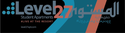
Level 27 Arabic Redesign: Case Study
Project Description
The goal of this project was to re-create a current design in our everyday lives into one that includes an Arabic translation. The main challenge of this project was to find a way to blend the Latin alphabet with the Arabic alphabet while also keeping what makes the brand identifiable. As someone who does not speak Arabic, this project was one that I knew was going to greatly challenge me. One of the most important insights I learned is that unlike English, Arabic reads right to left, so reading pattern was something that had to be considered on top of the challenge of designing in a language that you don’t speak. I learned a lot about how to make inclusive designs through this assignment.
Who Was Included
The main group of people who make up my audience is young literate English and/ or Arabic speaking people. I also got critique from a native Arabic speaking woman, Miriam, and she was able to correct the grammar and syntax of the Arabic parts of my design. She was important because the design would be highly flawed if she hadn’t pointed these mistakes out to me.
Research
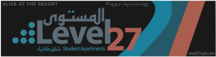
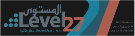
To start my research, I did some reading to better understand the Arabic language. I read “Rosetta- A brief overview of the various Arabic calligraphic styles” and “Harmonization of Arabic and Latin Script” to get insights on the culture around the language as well as see examples of how designers have approached this design problem in the past. The first notable thing that I learned is that Arabic can be written in different ways and the the typefaces all have different uses, some of which being mainly religious. So I knew I was going to need to pick an Arabic typeface that not only flowed well with the original Latin typeface, but also make sure that it was a socially appropriate typeface to use. I was able to deduce that the typeface used in Level 27’s original design is Myriad Pro Bold, and after a bit of digging, I found out that Myriad had an Arabic version. I was very lucky in finding this out because the Arabic and Latin text would be able to flow nicely since the font was the same for both bits of text.
Design Approach

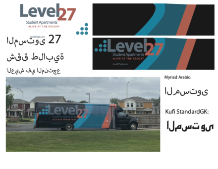
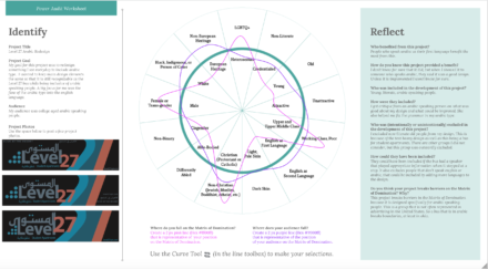
My initial research into understanding the brand and how to replicate it in Arabic.
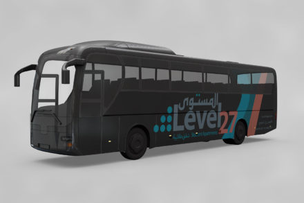
Above you can see some of my visual research and rough drafts as well as the the original design. I started by making a vectorized version of the original design to base my future designs on as well as experiment with different Arabic typefaces. You can also see three of my original drafts. In the feedback I got, I was told that my Arabic text was written backwards, so left to right instead of right to left. I was also told that these three were the most interesting compositions, but things still needed to be fixed for composition and legibility. I decided to keep pushing the 3rd design because I liked how the Arabic text sat inside of the English. You can see my final three drafts below.
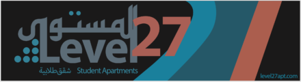
Final Deliverable
Reflections
In the end, I think my end design is pretty good. Looking back, there are a few things that I would change. I wish I gave the subhead a little bit more room on the top. This project was important because it was my first experience in designing in a different language and now I will be able to do it more easily in the future. I feel like this project helped break down barriers in the Matrix of Domination because it was designed for minorities in many ways. In America, there is hardly ever Arabic translations available, so if you don’t speak English, it can be very hard to live here. This design is specifically for Arabic speaking college students (since it is a bus for student apartments) to feel like they are included. I am proud of my work on this project.