Spread the Word: Black Lives Matter
Project Description
This project propelled Special Topics Design Studio students into our neighborhoods in search of type specimens that would benefit from a dual-language redesign. Specifically, we each located a short type specimen “in the wild” (like a yard sign), identified the Latin typeface it uses, analyzed the mood it creates, and worked collaboratively to redesign the specimen using both Latin and Arabic typography. This project challenged us to think outside our cultural comfort zones and to critically examine issues of access, power, and literacy. In the process, we discovered how designers can take a few key steps to serve broader and more inclusive audiences.
This project critically examines issues of access, power, and literacy.
Who Was Included
Our collaborative studio workshop included visiting designer and native Arabic speaker Miriam Salah. Miriam carefully critiqued our digital roughs, generously lending her expertise to our learning process. Miriam’s macro and micro lens helped improve my roughs into final comps, which, thanks to her feedback, use a more accurate translation of the important Black Lives Matter message and a more cohesive design. And I was fortunate to receive feedback on my working translation from a friend who is also a native Arabic speaker.
Research
This project is grounded in a review of the key research literature, including works that examine the cultural implications and functions of combining Arabic and Latin type. Building this foundational knowledge helped ensure that the project’s design outcomes developed from a place of mindfulness and respect of traditions different from our own. The design research methods used in this project include fieldwork (locating and photographing our type specimens), a collaborative studio workshop, and an informal interview with my Arabic-speaking friend. This qualitative approach provided valuable insights that connect two seemingly disparate audiences: Arabic-speaking cultures and the Black Lives Matter movement.
Because my background is in German language and literature, I came to this project with an understanding of the complications involved in relying on a translation service like Google Translate to generate an accurate translation of an English expression. Additionally, this project reinforced the importance of working directly with the cultures for whom we’re designing in order to produce meaningful and impactful outcomes. Designing in a vacuum isn’t productive. In striving to do no harm and even to benefit the people for whom we’re designing, we must include them in our process.
Involve design audiences in the process.
Design Approach
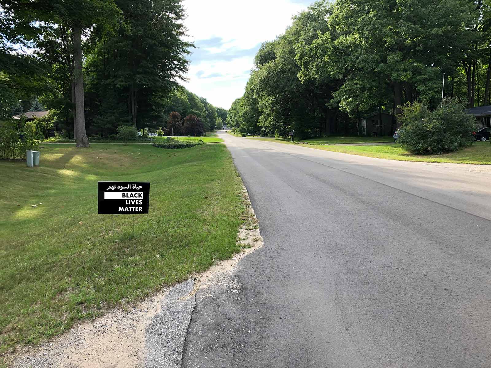
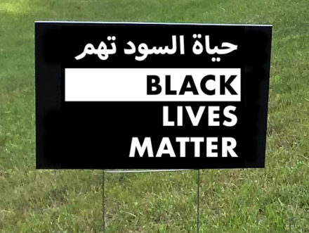
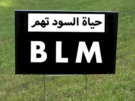
I found the type specimen shown in Figure 1 (a yard sign) in my Northern Michigan neighborhood.
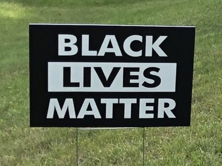
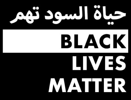
The large rigid typeface (probably a version of Futura), the center-aligned all-caps words, the stark contrast of black and white, and the rectangles with sharp corners used in the specimen reflect the sign’s persuasive purpose and the seriousness it elicits.
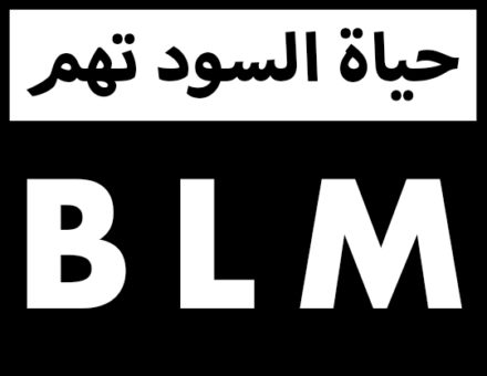
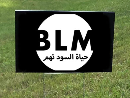
After some initial research, I thought the Naskh style captured a feeling similar to that of the original specimen. Like Futura, Naskh emphasizes legibility and efficiency. Additionally, the balance achieved by this Arabic calligraphic style seemed to mirror, in some ways, the balance of elements on the Black Lives Matter sign. I was also drawn to this pairing because both typographic styles share the goal of quick, clear communication that characterizes a call to action. In line with this thinking, I developed the sketches and digital roughs shown in Figure 2.
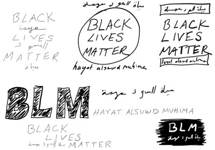
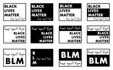
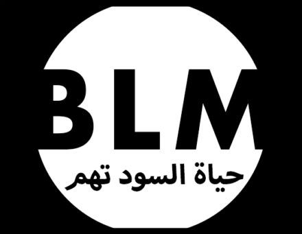
At this stage, I received helpful feedback from my peers, Zack Tucker, and Miriam Salah. My classmates encouraged me to explore some of the more creative approaches I drafted, and Zack and Miriam suggested I use Myriad Arabic instead of Adobe Naskh to better match the mood of the original specimen. Miriam also suggested I revise my translation slightly for accuracy and clarity. And a few people gave me good advice on balancing the English and Arabic words while not privileging one language over the other. With this feedback in hand, I revised my roughs and started developing the circular design shown in Figure 3. This process work helped me arrive at my final comps.
Final Deliverables
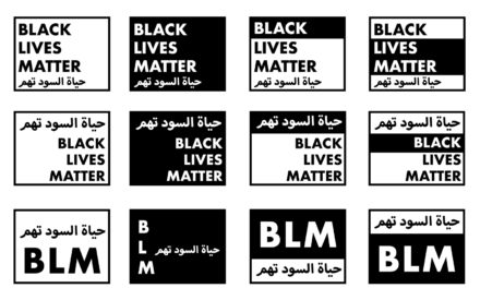
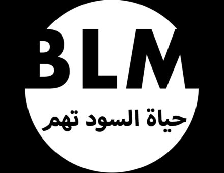
As I developed my final comps, I worked to achieve a balance within the different designs and variety between them. After submitting the final deliverables, I created mockups of the signs in the original context of the yard (see Figure 4).
Reflections
Revise, reiterate, reimagine.
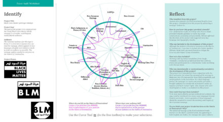
This project communicates the timely Black Lives Matter message to a multilingual audience. This universal message breaks most barriers on the Matrix of Domination (see Figure 5) because of its emphasis on equality, inclusion, and social justice. By appearing in both English and Arabic, the message also spans cultures. This project could be expanded by including speakers of languages other than English and Arabic to reach even more people. Incorporating audio into the project would also increase access to non-literate audiences. Future research could integrate co-design methods, like a design charrette, that creatively involve members of the communities that this design serves. Finally, applying a social interactionist theoretical lens to this project might produce insights into how design audiences use dual-language outcomes like the Black Lives Matter signs as a tool of social interaction and empowerment.