Instructions
Your final case study should share the story of your project from start to finish and should include several elements you defined, researched, and created over the semester.
Each of the blocks below is currently hidden. Remove the “hiddentext” class in the “Advanced” block field on the right side of this page to reveal each content block before you publish your final case study. Otherwise, your text will not show up.
Before you publish: change the title of the page and the permalink to your project title.
Delete everything in the instructions block before you publish the page.
Project Description
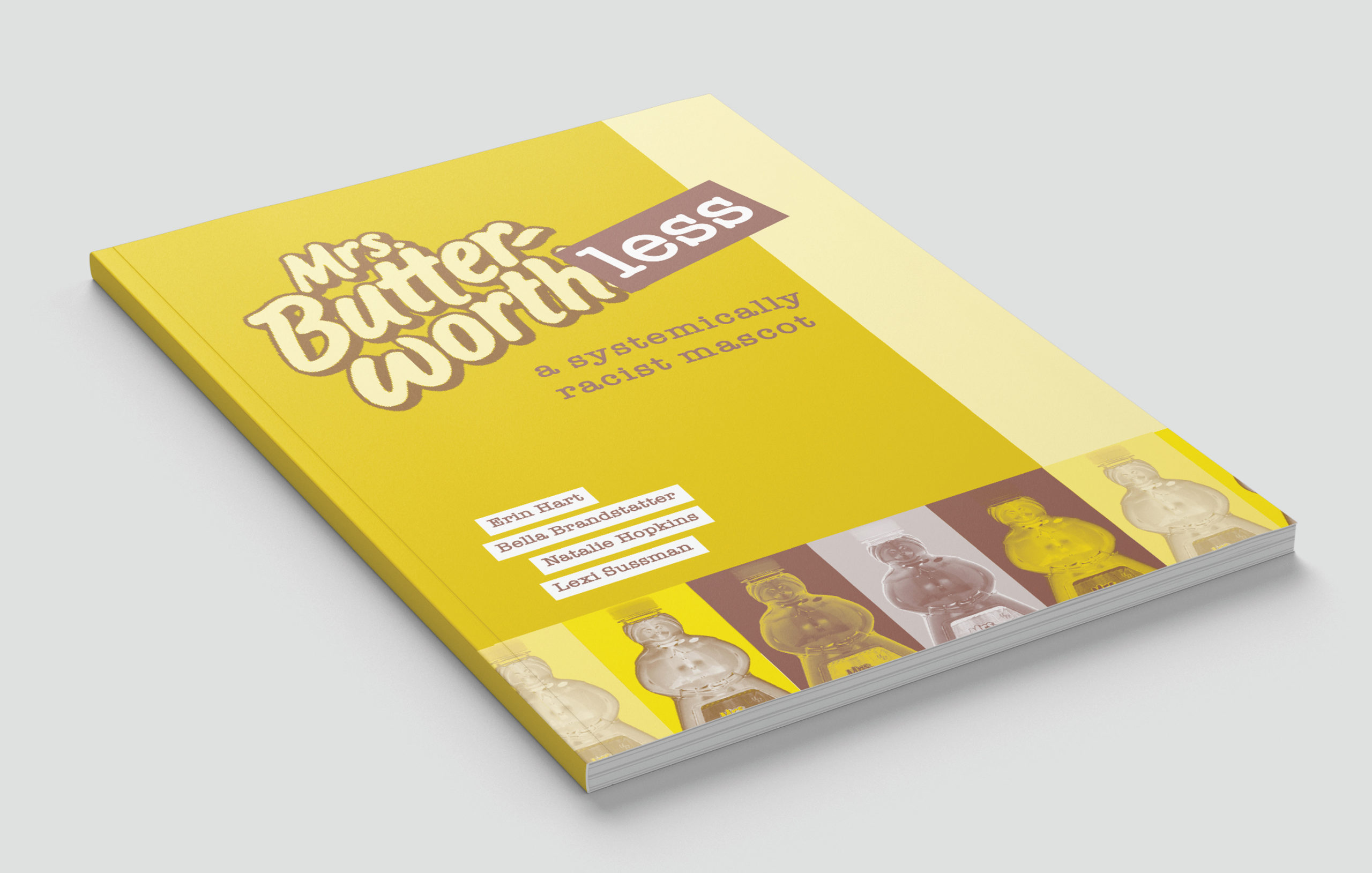
Cultural appropriation in product design has been brought to the forefront of media recently. Through the creation of a zine, my team and I took a deeper look at not only the cultural appropriation happening in the product Mrs. Buttersworth syrup, but also perpetuating racial stereotypes and discriminatory domestic symbolism. Our goal was to inform the reader of what is wrong with the design as well as why it is not acceptable in today’s society. From our research, we found it important to include the history of the bottle shape to emphasize the unsettling inspiration for this company’s mascot.
Who Was Included
I had the honor of working with Natalie Hopkins, Bella Brandstatter, and Erin Hart on this zine project. They were beyond important contributors to this project as we all divided the work and ensured completion of the project. I had the privilege of informing myself on the unrealistic domestic symbolism used when generalizing the women’s shape and roles in society. In addition to that spread, I helped create the iterations of the back and front covers. Our audience for this project was directed towards the users of Mrs. Buttersworth syrup as well as anyone who wants to improve the racial footprint they are leaving on the economy.
Research
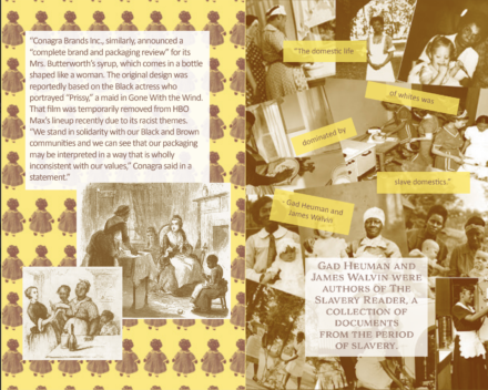
When researching for this assignment, we, as a group, decided to use the three topics as starting points. I personally looked into the reasons Mrs. Buttersworth contributes to perpetuating stereotypes. From my research, I found that Conagra was interested in rebranding due to the imagery that the bottle resembles. The bottle’s shape is based upon a mammy doll or a black female house slave. This really strengthens our arguments of perpetuating black stereotypes, by making the black women’s body maternally as well as curvy. It also proposes the amount of domestic symbolism used when looking at the syrup brand. Women are seen as synonymous with being in the kitchen and in today’s society that isn’t the place for women. This provided me the basis for my spreads as well as information for my fellow group mates.
Design Approach
My process started by deciding, as a group, what stylization we wanted to accomplish. The brand is very heavily rooted in the colors of yellow and brown, as well as echos the racial contrast. I received a lot of feedback on my cover and as a group, we worked together to finalize the design to the best of its ability. With my spread, I had originally quoted an article that I had read, but my group members pointed out that the other pages had paraphrases and self-written paragraphs to convey what they were trying to say, so I had used their feedback to make my spread better.

Final Deliverable
Reflections
I think that this project was extremely successful. My group worked really well together and I learned a lot. I found this project extremely important and relevant. It touches on an issue so prevalent in our everyday lives: that black people are seen as lesser or in a different way than white privileged people. It reached a lot of people in our Power Audit and I think that that’s why it is so important. As a firm believer in synchronous or physically in-person classes, I think that this project could have benefited from in-person group time. Normally that is something that could be worked into a hybrid class, however, I understand that that wasn’t possible this semester.


