Peeling Back the Truth on Chiquita Banana

Project Description
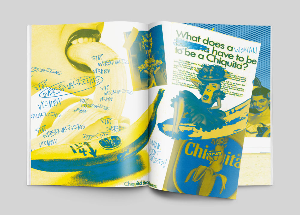
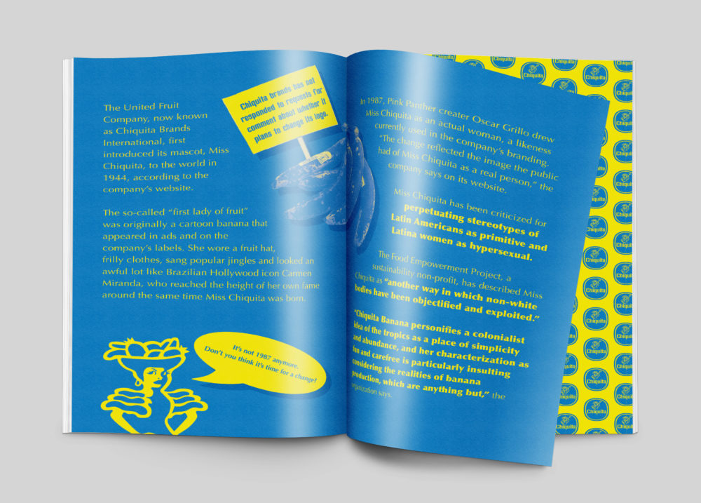
In this project, I worked collaboratively with three other team members to develop a zine that explores how Chiquita, a well-known and established banana brand has worked to support the dominant culture and disadvantage non-dominant groups through the use of tactics like Latin American misappropriation, worker exploitation, and female stereotypes. The non-dominant groups that were disadvantaged by Chiquita are Latin American, working class females. The goal of this project was to create a high-fidelity, 16 page zine that would build empathy between misrepresented groups and the dominant culture. This in turn would hopefully expose Chiquita’s controversial past and inspire change in the future.
Who Was Included
My role in this project was to create compositions that would help to build empathy between misrepresented groups and the dominant culture from research findings. By building empathy between these groups, my teammates and I hoped to include disadvantaged groups, who were in our case people of non-European heritage, of color, who are in the working class, and are female. In order to gain insight and inspiration for this project we participated in a collaborative studio workshop where external collaborator, Art and Humanities Librarian, Stefanie Hilles introduced us to visual concepts and gave us a new perspective on the role of zines in social movements and counter-cultures. She also helped us to understand how appropriation could be integrated as a way of reinterpreting existing text and image. The audience for this project is anyone who is literate and is aware of Chiquita as a dominating banana brand.
Research
My teammates and I worked together to create a clustered dissection table from eight scholarly sources found on the web. By reading these sources I was able to better understand important social issues surrounding the Chiquita brand and how Chiquita works to support the dominant culture. Chiquita was built upon cultural misappropriation and with ideas of Manifest Destiny in mind. From this table were we able to synthesize key information gathered, generate ideas and establish themes that would help us develop visual concepts for our zine. The themes we explored were Latin American misappropriation, worker exploitation, and female stereotypes.
Design Approach
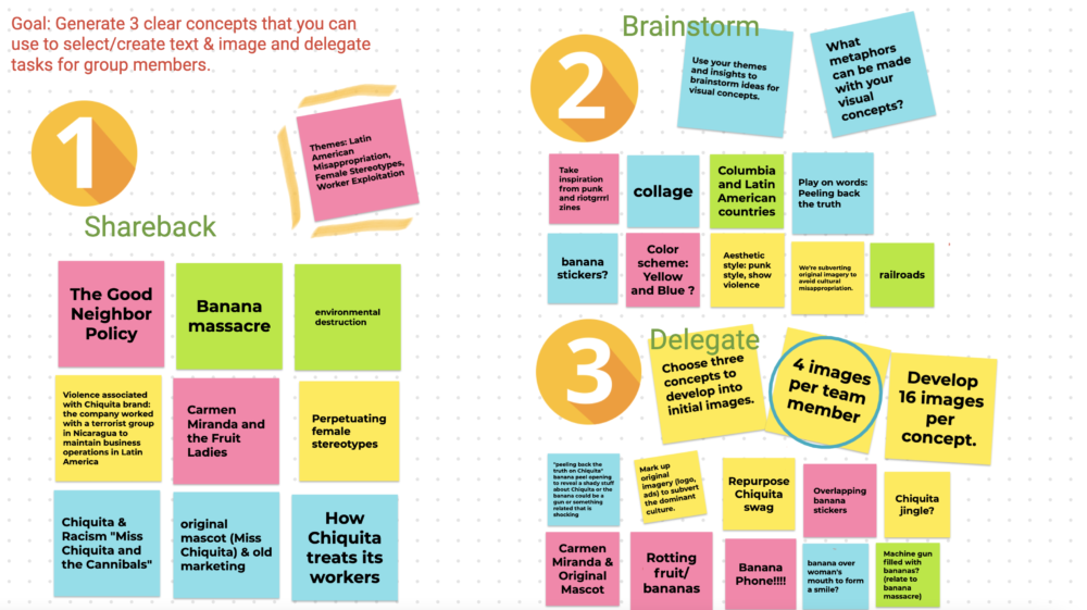
After researching, my teammates and I got together and shared what main ideas and social issues we wanted to address in our zine. We then brainstormed how we could display the information we gathered visually and what ways would work best. After deciding which directions we wanted to go in visually, we delegated team members to create and develop key visuals we would use in our zine.
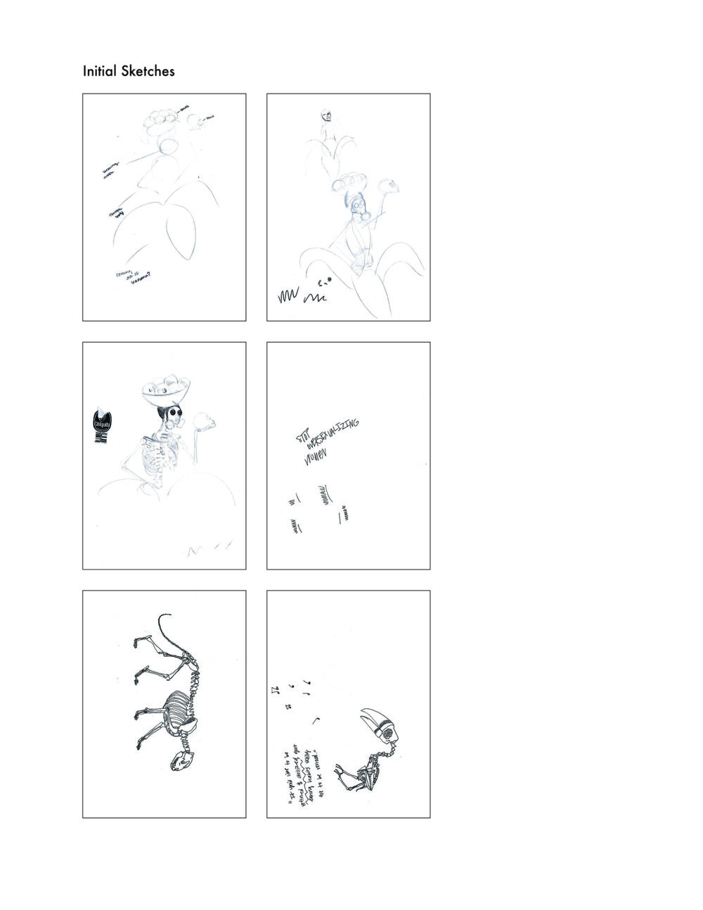
After meeting with team members, I sketched out the main images I wanted to create and potentially use in our zine pages. I then gathered images from the internet that I felt I could change and appropriate to develop new visual concepts from. The next step was to develop digital roughs from my sketches.
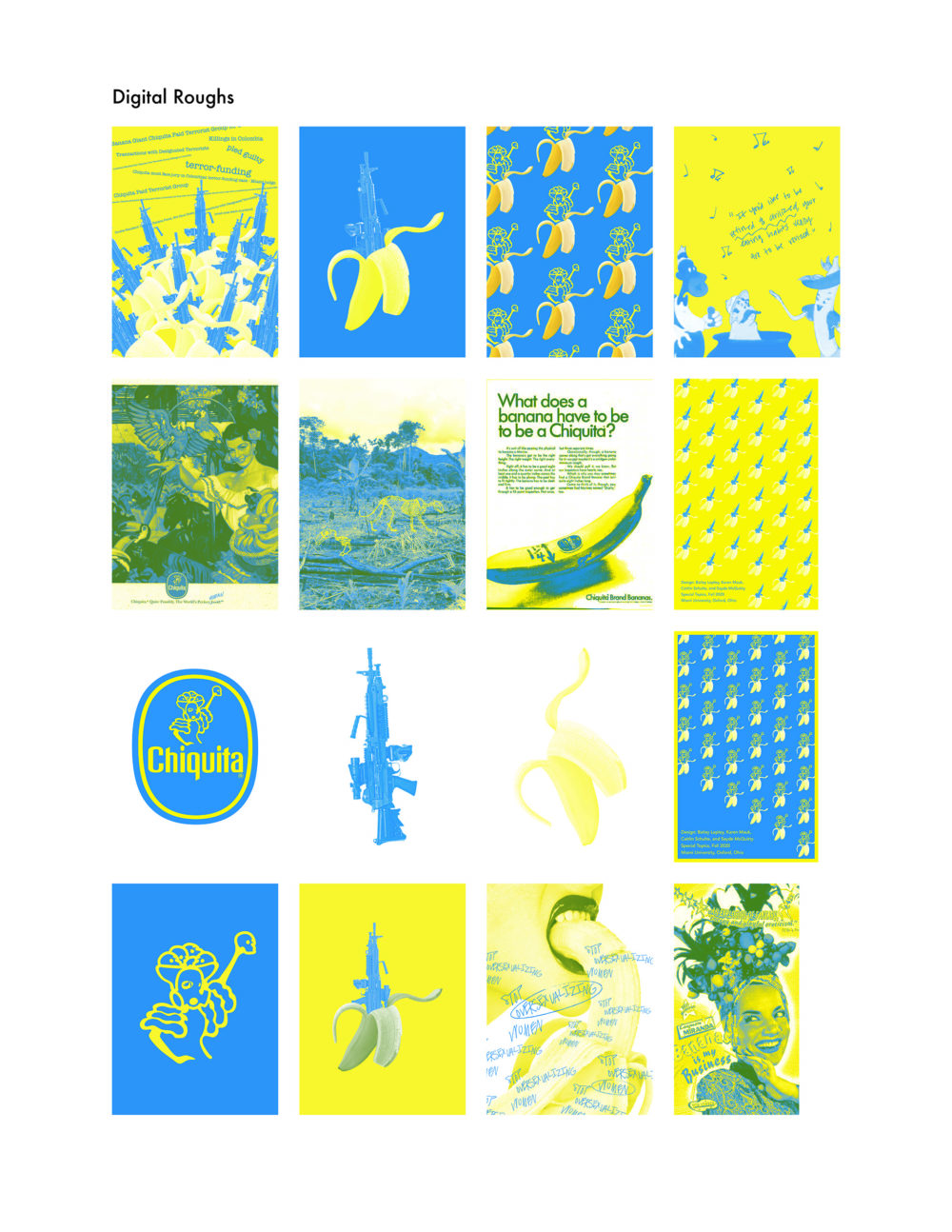
At this point in the iterative process I received feedback from my classmates and professor as to how I could improve my digital roughs. My teammates enjoyed how I was able to manipulate the spot colors so that they were vibrant and maintained their purity. They also thought that my appropriation of the Chiquita banana logo was successful and thought it could be used on the cover of our zine. The digital rough I received the most feedback on was the one that used a snapshot from an old commercial of Chiquita’s called, “Chiquita Banana and the Cannibals.” One teammate pointed out that the image was pixelated and this was amplified by my choice to cut out the figures and place them on a solid colored background. Another added that it felt like I was trying to fill space with the music notes and suggested flipping the canvas so that it was horizontal instead of vertical. At this point I was assigned to be responsible for creating our front and back covers and our call to action page.
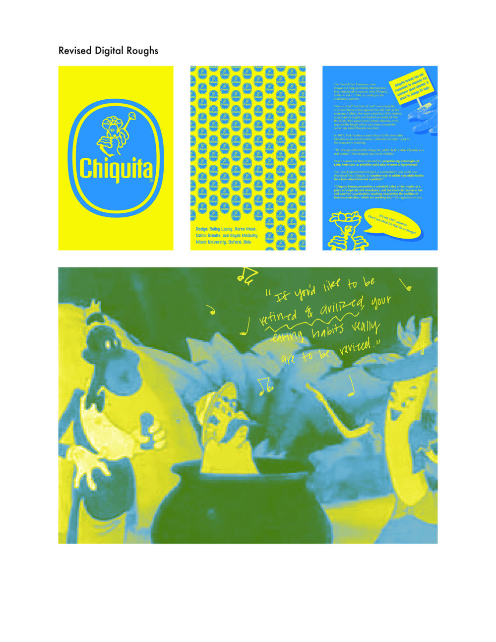
In this step of the iterative process, I took my teammates’ advice and changed the image taken from “Chiquita Banana and the Cannibals.” I made the canvas horizontal so most of the focus was on the figures in the scene, chose not to cut the figures out at all, and removed some of the music notes. From here I also worked on finalizing our front, back, and call to action pages.
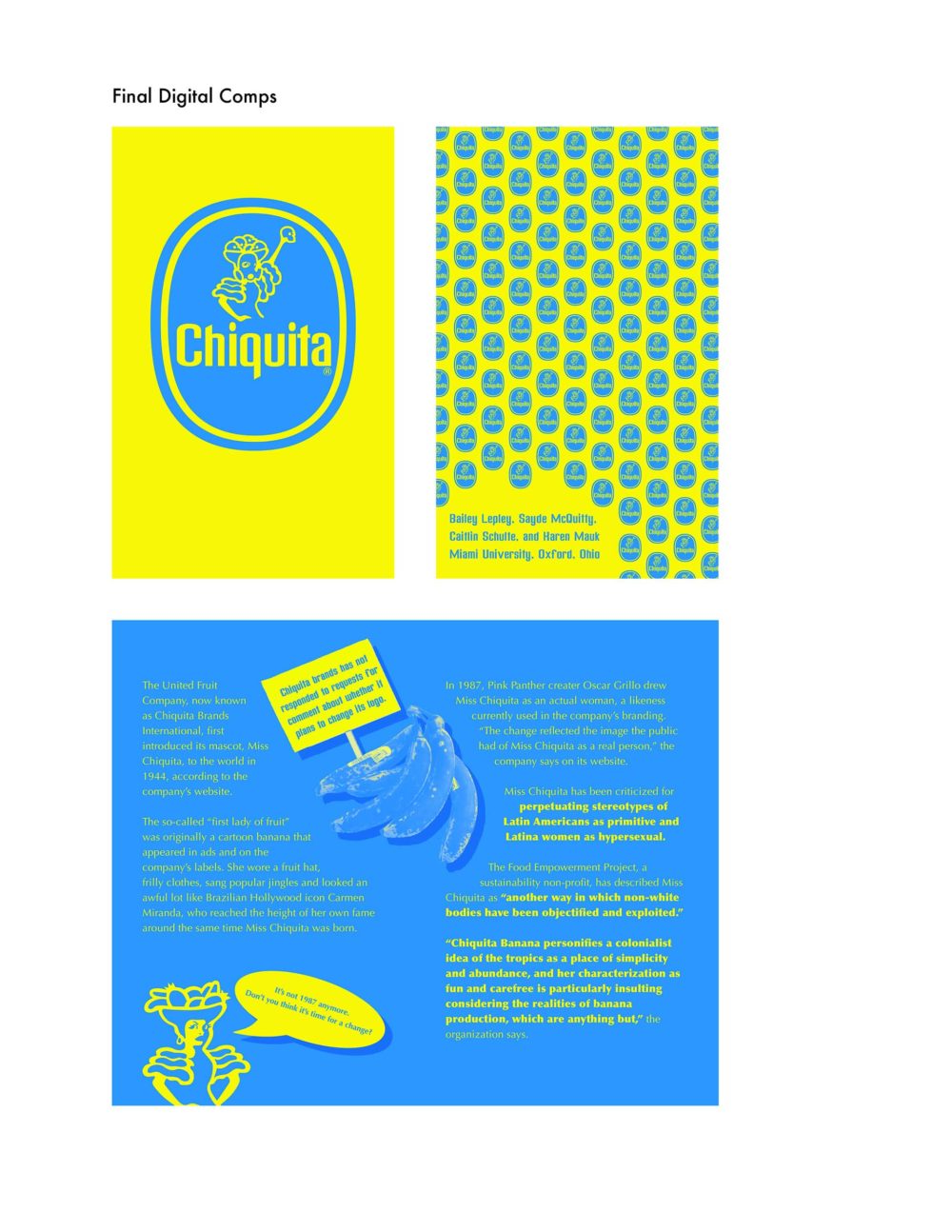
In the final round of iterations, I made small changes suggested by my team members like offsetting the Chiquita logo, removing some of the stickers in the back cover page, and spreading out the information from the call to action page into two pages.
Final Deliverable
Reflections
Overall, I feel satisfied with how this project turned out. I believe my teammates and I were able to create interesting compositions that combined type and images in new and thought-provoking ways. I also believe we successfully focused on important social issues central to the Chiquita brand and that these issues are clearly emphasized in our designs. If I were to do this project again I would devote more time to generating images that could be appropriated in new ways in order to give power back to our disadvantaged groups. I would have also been more careful to only use two spot colors when creating my designs. This way our zine could be reproduced and distributed at an affordable cost.
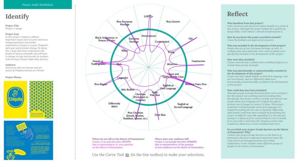
Below is a Power Audit Worksheet. My classmates and I used this tool over the course of the semester as way to reflect on how well we are designing for a broad range of different people rather than an exclusive group. This tool also helps to keep us accountable as human-centered designers. I believe our zine starts to break barriers on the Matrix of domination because it addresses important issues like Latin American misappropriation and worker exploitation central to the Chiquita brand and includes many different groups of people on the Matrix of Domination, giving power back to disadvantaged groups.
