Rumpke Dual-Language Logo Redesign
Project Description
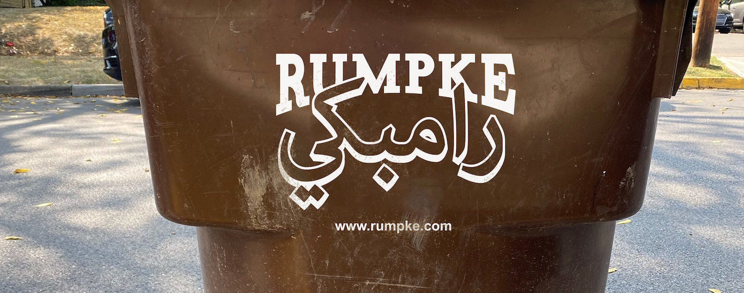
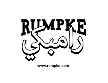
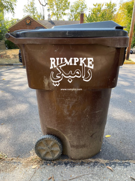
There are only about 100 Arabic typefaces, compared to over 100,000 designed in the Latin alphabet. The goal of this project was to take a type specimen found in everyday surroundings and redesign the specimen for a dual-language format. The specimen was first analyzed to identify the original typeface used, and the mood/feeling/vibe it creates through its style, size, and context. The final outcome required creating a unified design that included an Arabic typeface that spoke to the same mood/feeling/vibe as the original specimen.

Who Was Included
The audience of this project is Arabic and English speaking users of Rumpke trash services. This project was developed individually with guidance and feedback from a visiting designer, and native Arabic speaker, Miriam Salah. She played a very important role in the development of this project as she offered the perspective of an Arabic speaking viewer and gave feedback to ensure the design was as successful in Arabic as it was in English.
Research
Through my research, it was interesting to learn more about Arabic typefaces and how they compare to Latin typefaces. Some of the most interesting things that I was able to learn was that Arabic letter forms place a greater emphasis on elegance and beauty compared to Latin letters where the strong focus is mainly on legibility. Another concept that I found really interesting was how some Arabic designers spoke to how it was challenging for them to create contemporary design work in Arabic due to the lack of modern Arabic typefaces. Overall, my research really helped me to appreciate my own privilege I have as a designer working with Latin typefaces. I am able to have such a wide variety of typefaces to choose from, where Arabic designers do not.
Design Approach
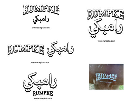
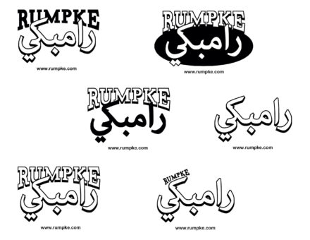
After researching, it was time to start creating some rough digital designs. I wanted to recreate the same drop shadow effect of the Rumpke logo onto the Arabic type, so I tried playing around with both languages having the drop shadow and how they could overlap to create a unified and cohesive shape. The biggest challenge was making sure that both languages came through equally in terms of hierarchy and were both easily recognizable and legible. Feedback from Miriam was helpful in ensuring that my translation was accurate and hierarchy was strong.
Final Deliverable
Reflections
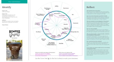
The United States is a country with a rising population of non-English speakers, and being able to create dual-language designs to accommodate more people is becoming more important than ever. As an English-speaker my whole life with little knowledge of other languages, I have realized the importance of getting the perspective of native-speakers in the language I am designing for. In the future, it is essential for the audience the design is intended for to have a say in how they perceive the dual-language design before being implemented. Through the Power Audit Worksheet, I was able to show how my design was able to successfully break barriers on the Matrix of Domination by being inclusive to a wider variety of people. Additionally, my design can be replaced with other languages to reach an even larger audience based off certain area demographics.
