Sycamore Street Revitalization Project

Project Description
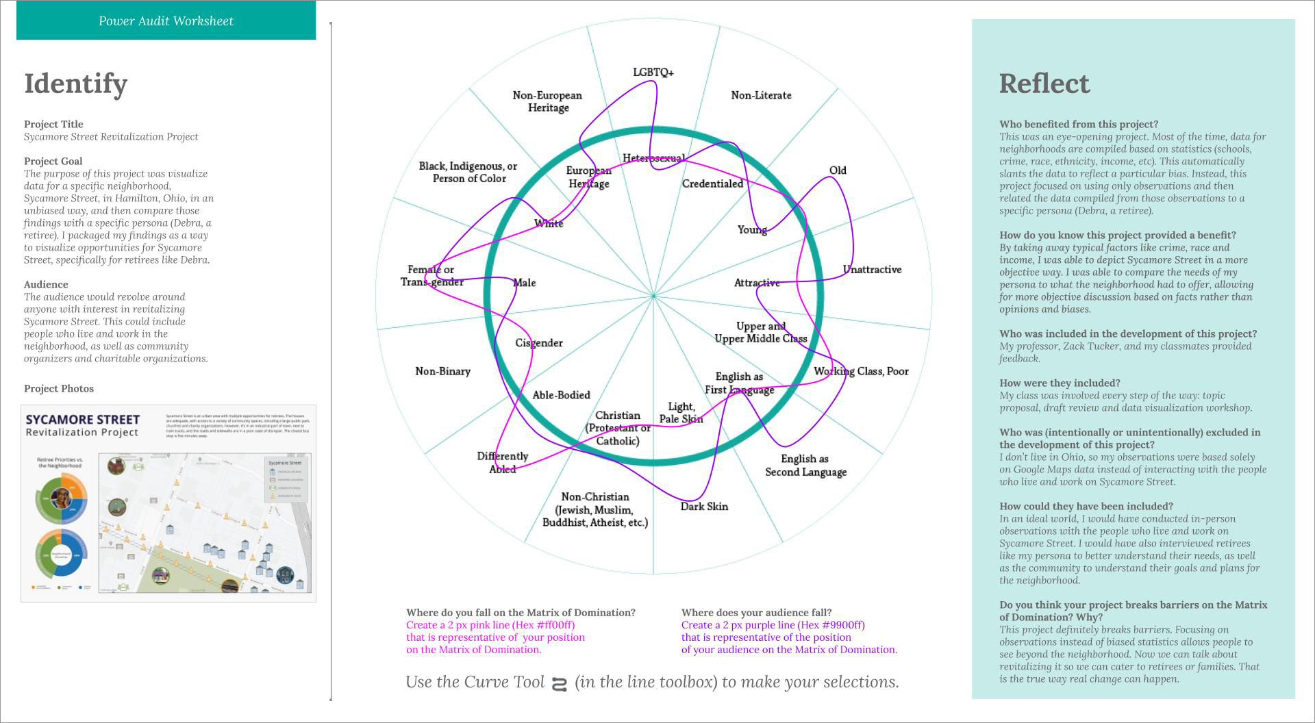
The purpose of this project was to visualize data for a specific neighborhood, Sycamore Street, in Hamilton, Ohio, in an unbiased way, and then compare those findings with a specific persona (Debra, a retiree).
Most of the time, data for neighborhoods are compiled based on statistics (schools, crime, race, ethnicity, income, etc), which automatically slants the data to reflect a particular bias. Instead, this project focused on using only observations and then related the data compiled from those observations to a specific persona (Debra, a retiree).
Who Was Included
My audience would revolve around anyone with an interest in revitalizing Sycamore Street. This could include people who live and work in the neighborhood, as well as community organizers and charitable organizations. My professor, Zack Tucker, and my class were involved in every step of the way: topic proposal, draft review, and data visualization workshop.
Research
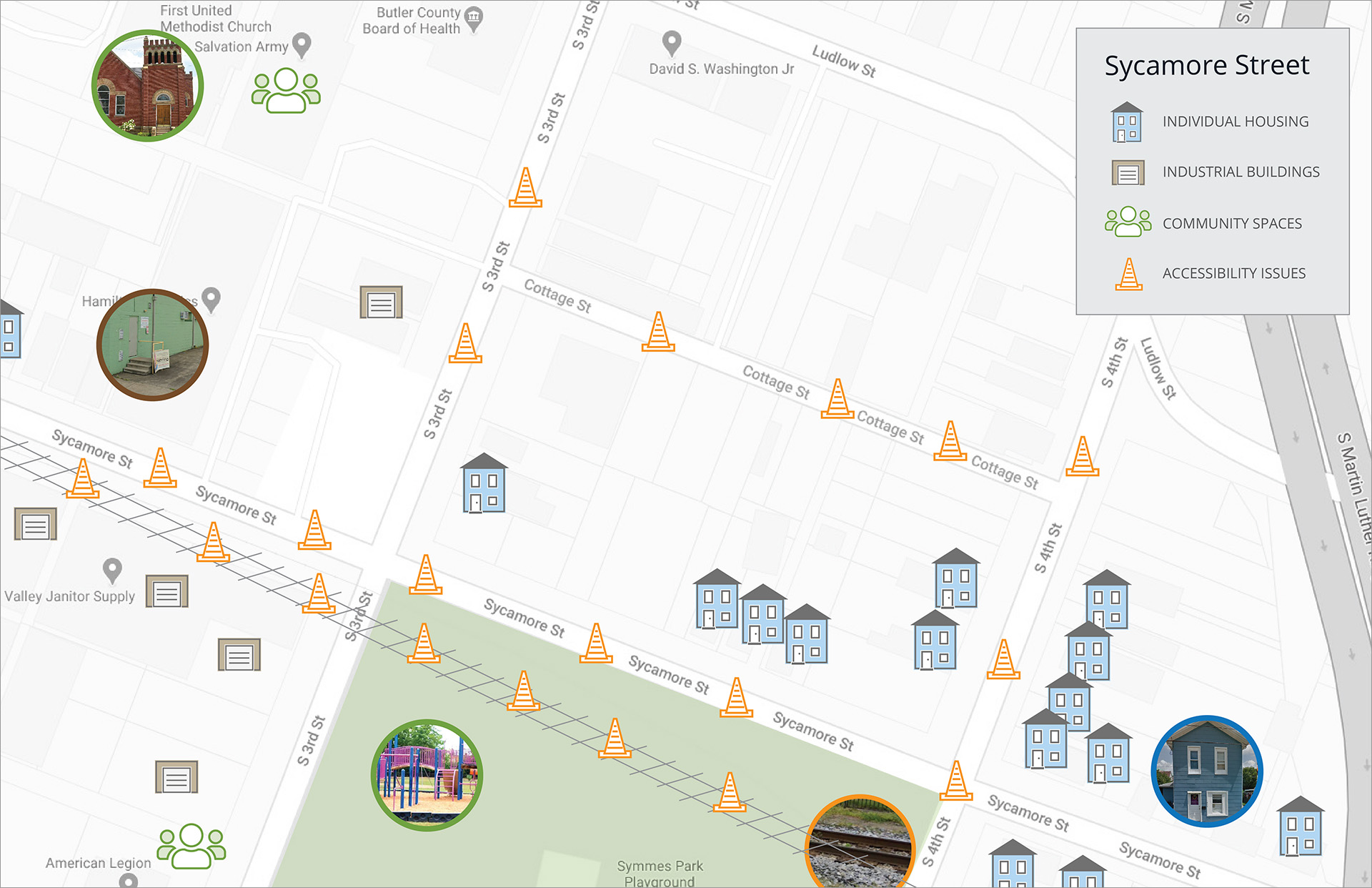
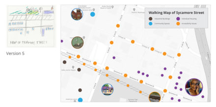
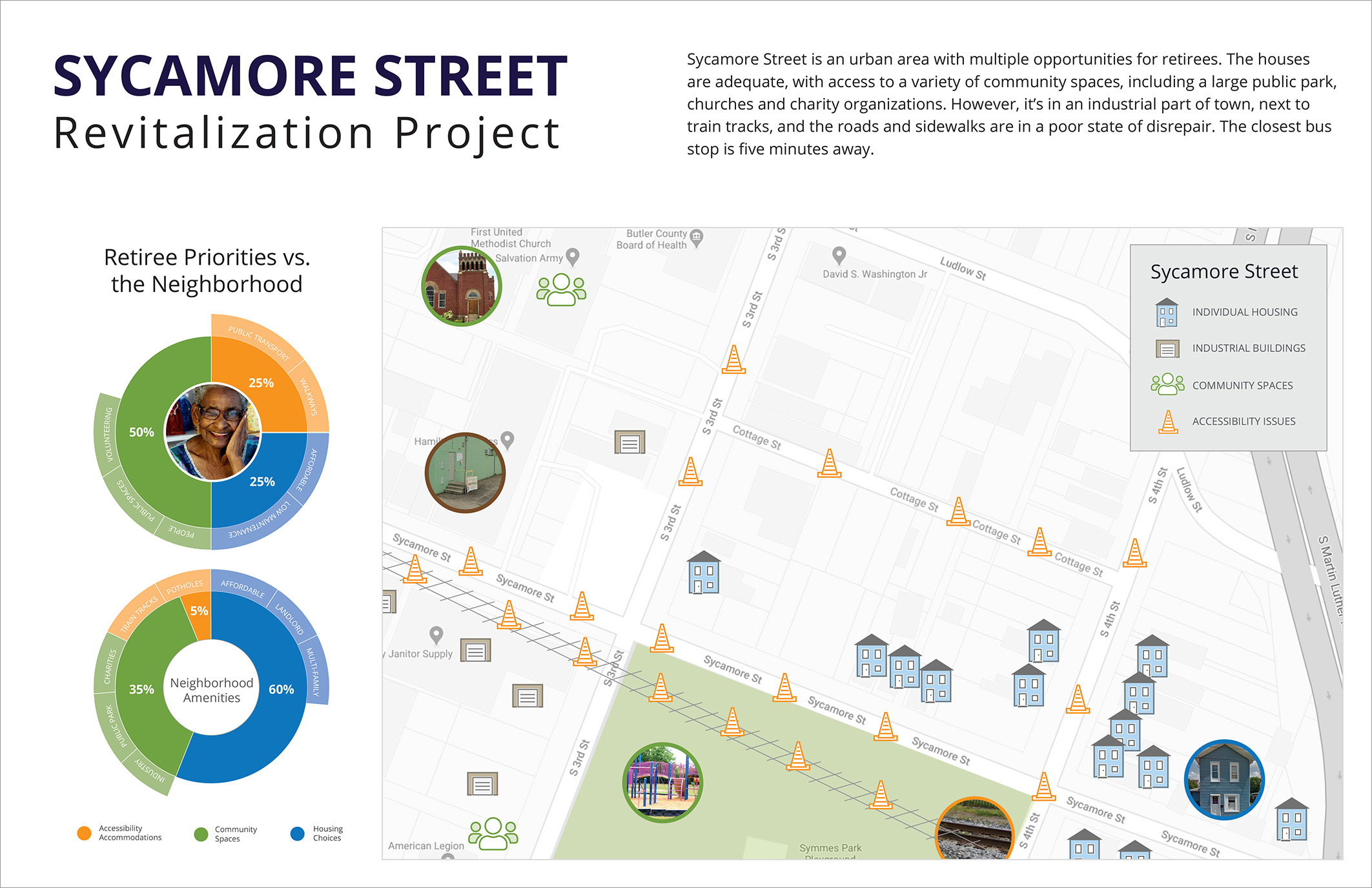
The Research phase consisted of a group workshop, where we discussed how researchers often visualize data in a way that’s biased. In breakout groups, we analyzed Sycamore Street in Hamilton, Ohio using Google Maps street view and then categorized our findings by public infrastructure/accessibility, community assets, and home condition/maintenance.
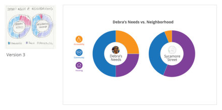
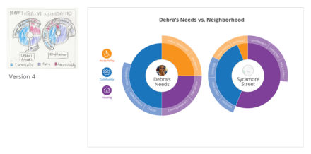
Afterward, I conducted a complete analysis of the area surrounding Sycamore street from the lens of a specific persona, a retiree named Debra, who is single and walks with a cane. Unfortunately, Sycamore Street does not meet Debra’s needs. While the houses are adequate, and Debra has access to a public park and several places to volunteer, it’s in an industrial part of town, next to train tracks, and the roads and sidewalks are in a poor state of disrepair. The closest bus stop is five minutes away.
Design Approach
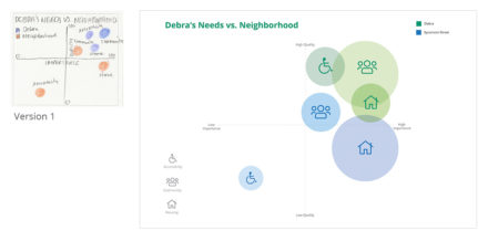
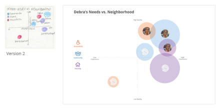
Since the neighborhood does not meet Debra’s needs, I focused on a variety of ways to use data to compare Debra’s needs (community, housing, accessibility) to what the neighborhood has to offer in an unbiased way so she can make a more informed decision.
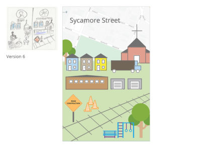
In the Design phase, I started by creating 25 thumbnail sketches reflecting a variety of methods to make this comparison: pie charts, bar graphs, scatter plots, sunburst charts, and Venn diagrams, along with more creative visualization methods such as walking maps and neighborhood illustrations. Six sketches were perfected as digital roughs.
Sketches and Rough Drafts
Final Deliverable
Reflections
This was an eye-opening project. By taking away typical factors like crime, race, and income, I was able to depict Sycamore Street in a more objective way. I was able to compare the needs of my persona to what the neighborhood had to offer, allowing for more objective discussion based on facts rather than opinions and biases.
This project definitely breaks barriers. Focusing on observations instead of biased statistics allows people to see beyond the neighborhood. Now we can talk about revitalizing it so we can cater to retirees and families and effect true change.